


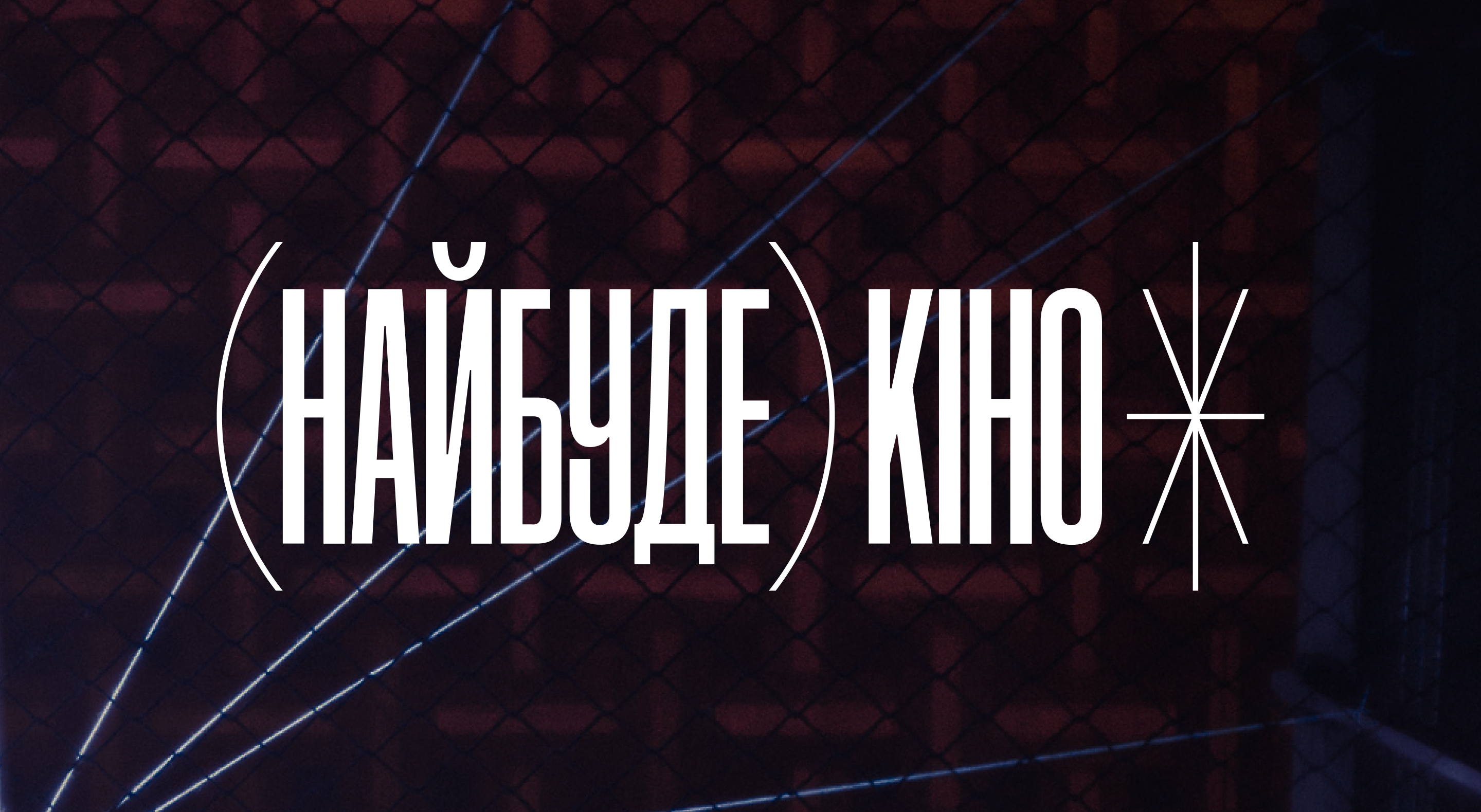


TEDxNaUKMA
Services
Brand
Industry
Art, Culture
Awards
Red Dot Design Award: Best Of The Best
Ukrainian Design: The Very Best Of
ADC*UA
ADC*Europe
Kyiv International Advertising Festival
Behance x2
Flexible and distinctive visual style for local TEDx conference while preserving the franchise’s long story and core traces.
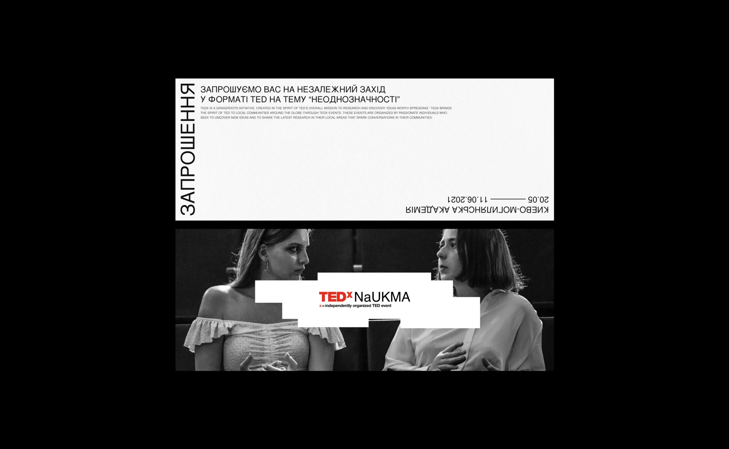
Known for sharing insights and extraordinary thoughts, TED empowers others to share their ideas. That’s what they have TEDx. One can get a license and hold an independent conference. In 2021, the Kyiv-Mohyla Academy received such a license for the second time.
Independence means the team independently creates an educational phenomenon: messages, programs, promotional campaigns, and partnerships. We became design partners and developed the visual identity of the conference.
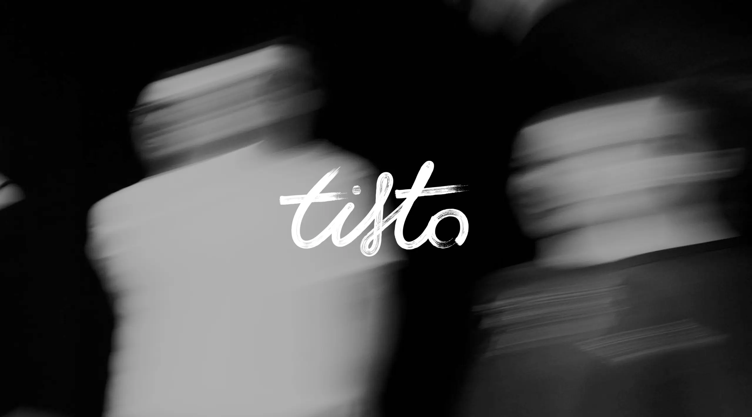
Our task was to create a fresh style for the local conference and integrate it into the existing identity of the global network. It was essential for communication, so the signature red color remained. We had to invent the rest.
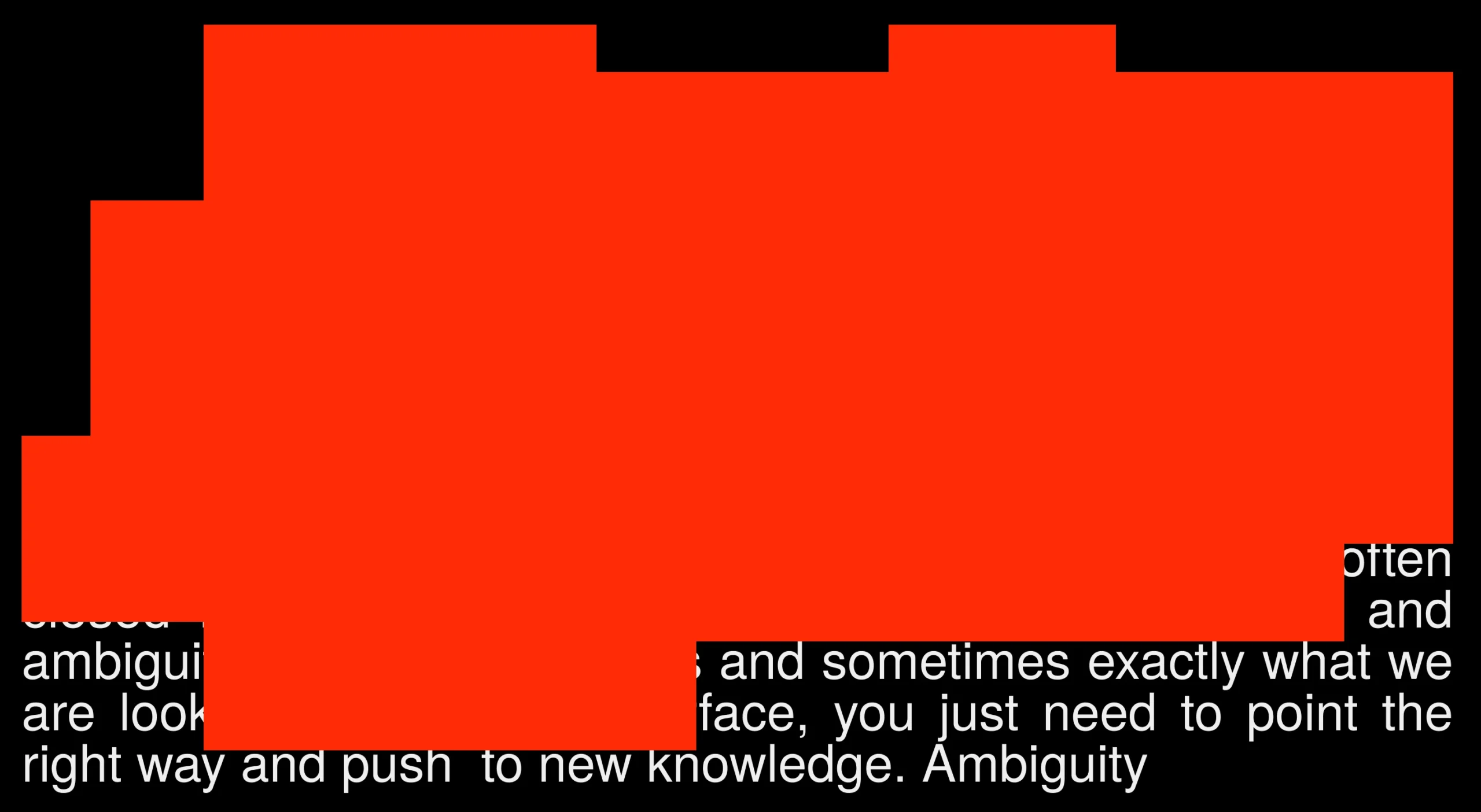
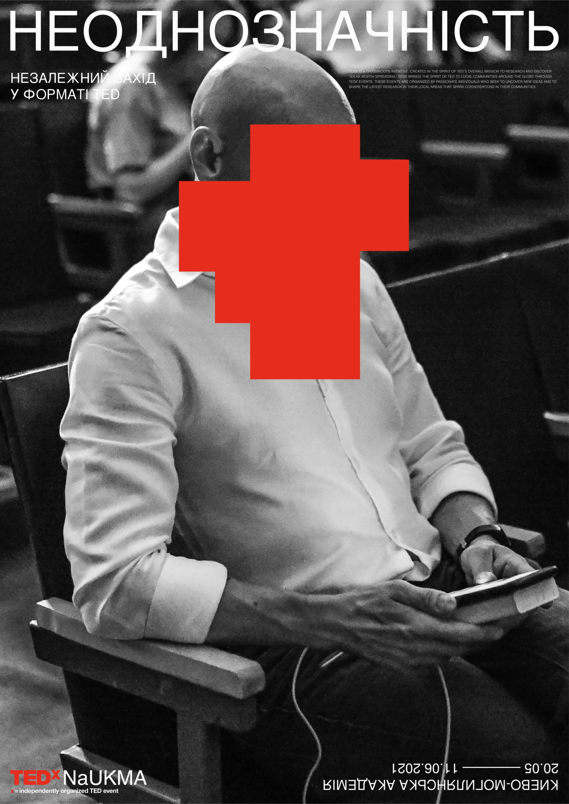
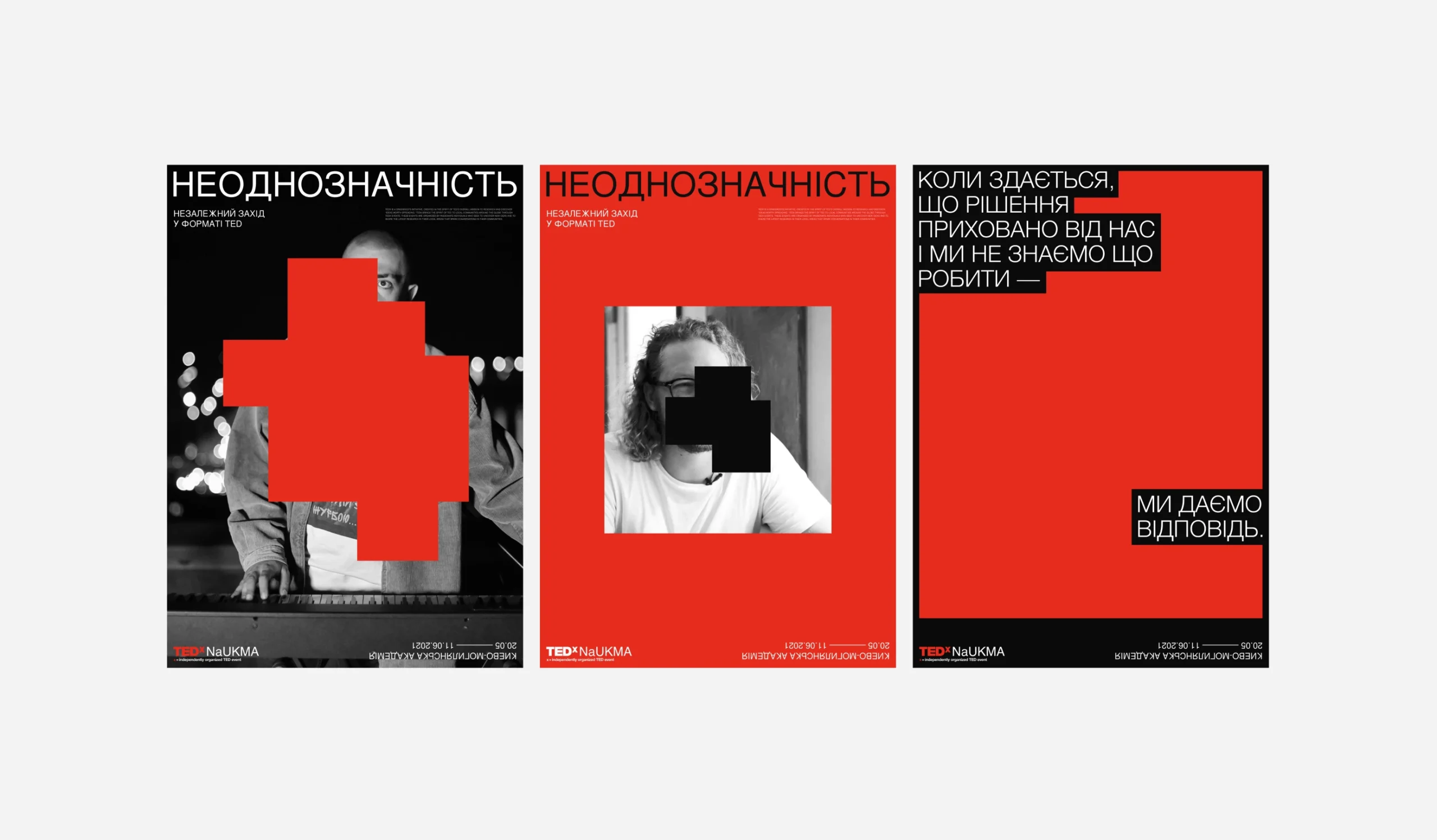
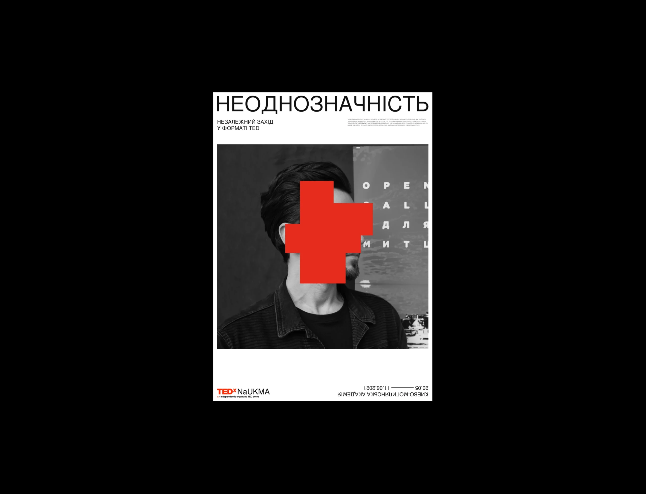
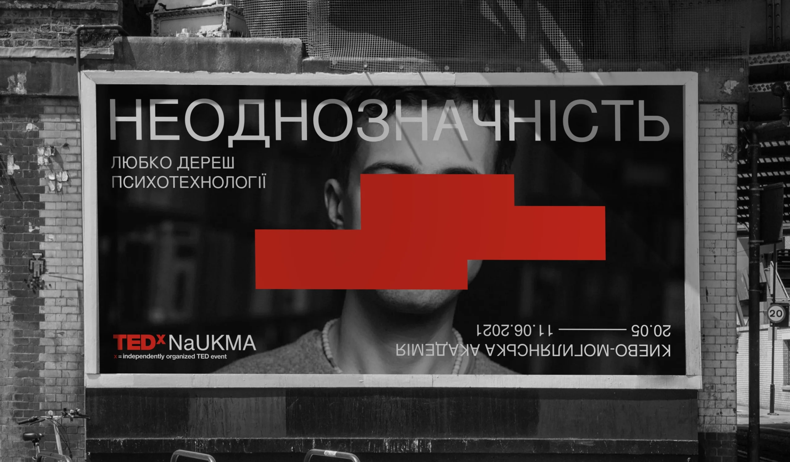
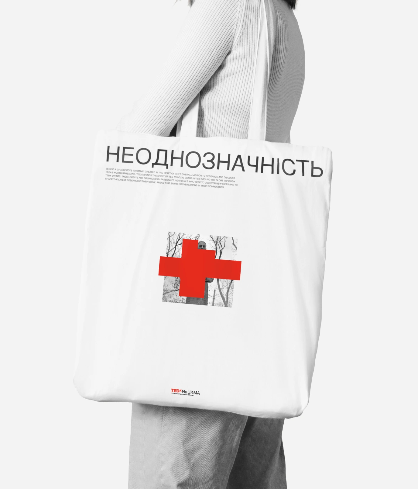
The theme of the conference is ambiguity. For us, an abstraction became its visual allegory, which has a great potential for visual embodiment.
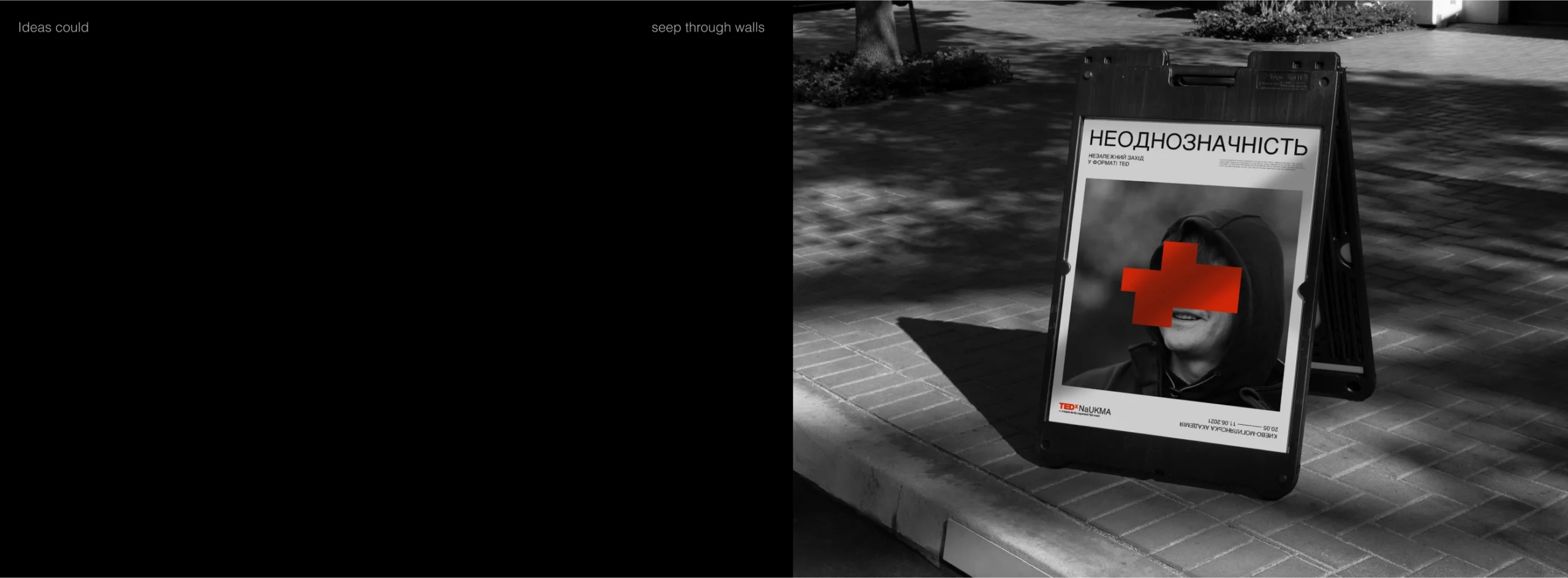
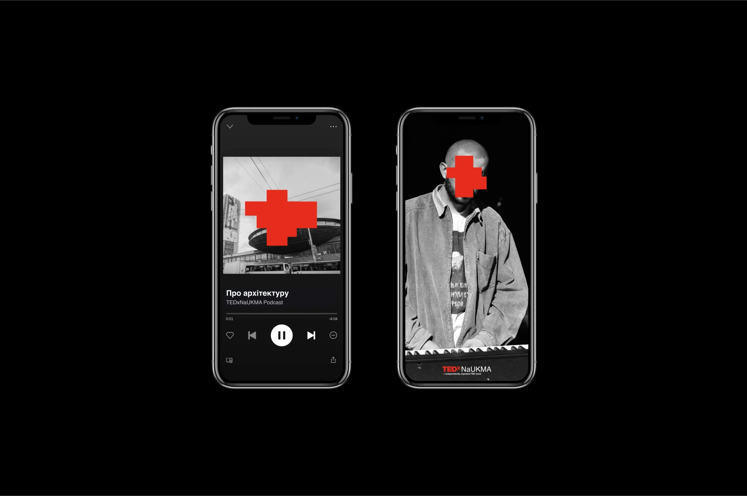
We started looking for a form of abstraction and found a solution in the facades given to us by the graffiti removal phenomenon. We liked that the writing can still be seen under abundant layers of paint. Thus, “by hiding, we could create new meanings” became a fundamental concept of identity, which also rhymes with the TED slogan “ideas worth spreading.”
We faced the challenge of doing something original when everything had already been done for a project with a long history. Over several iterations, we arrived at a complex solution that managed to separate the event from that story, isolate it, and at the same time preserve its heredity.
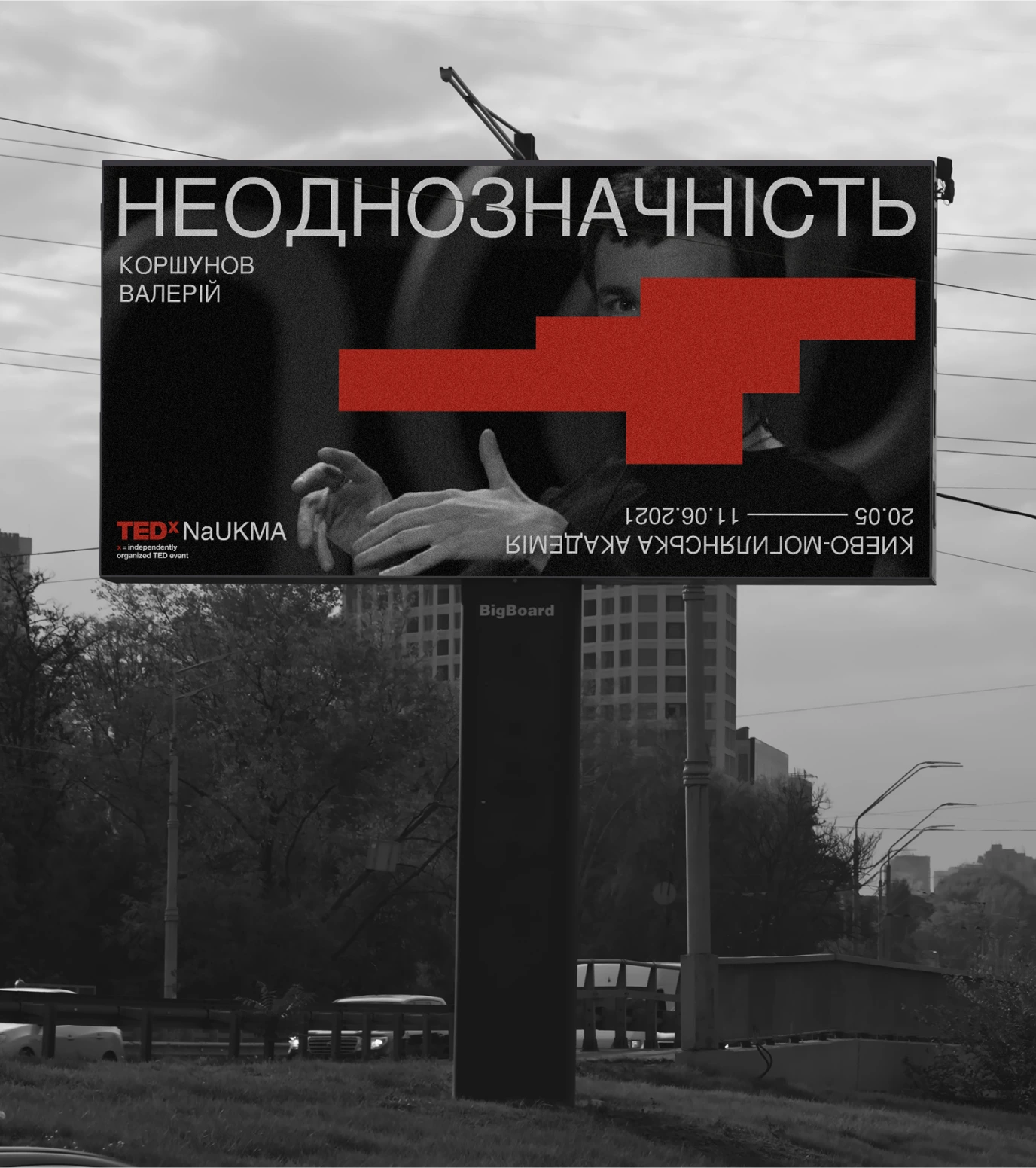
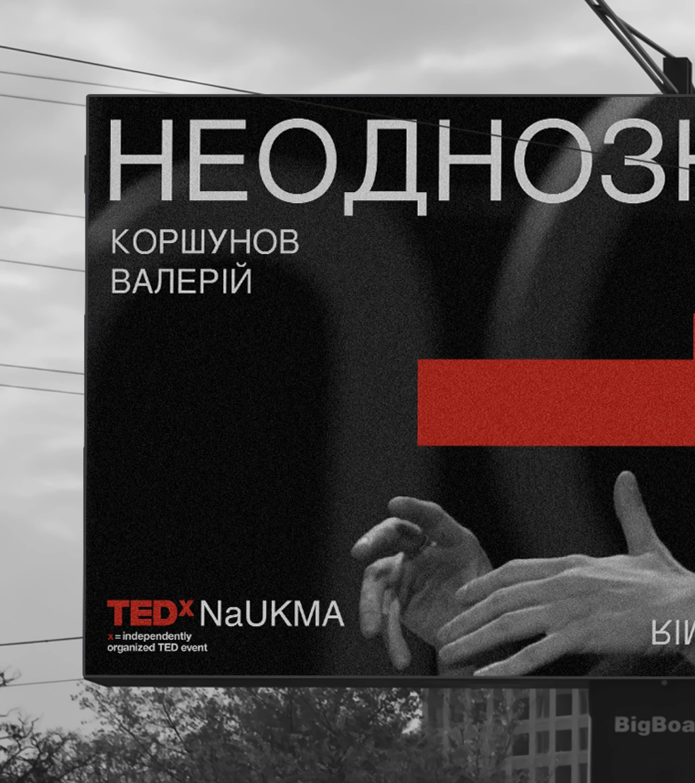
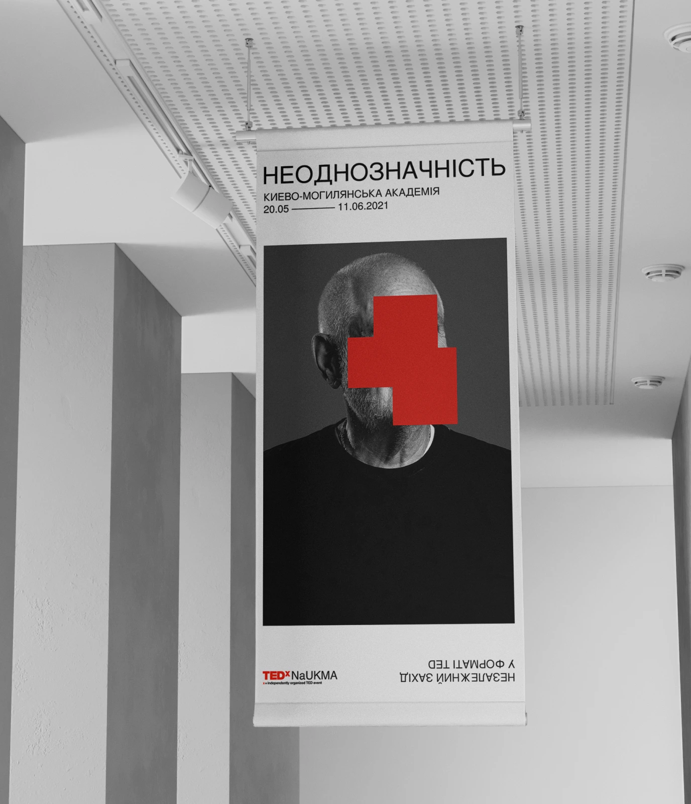
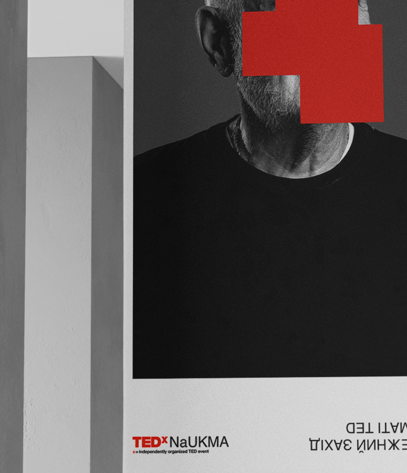
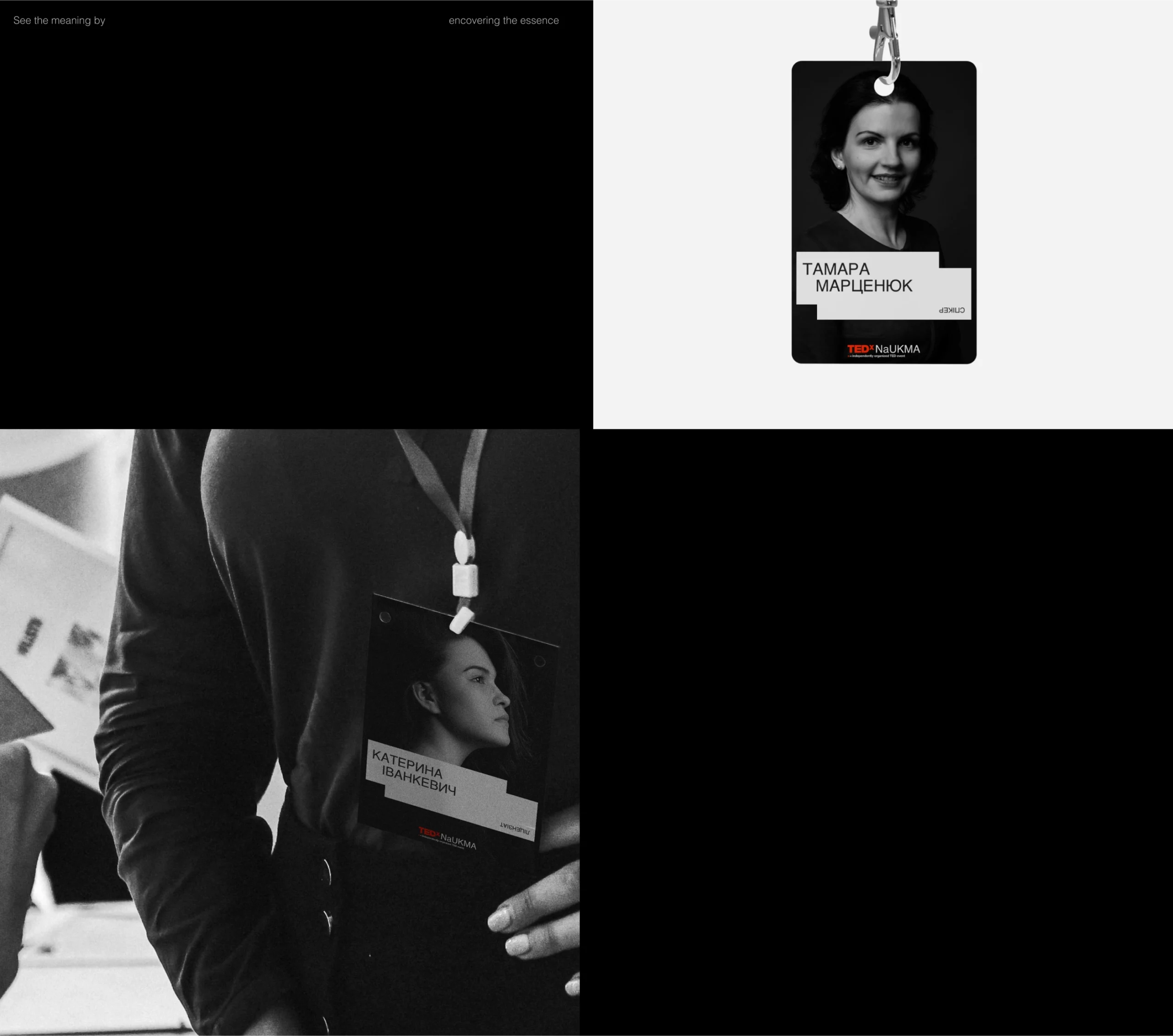
We created a flexible style with expressive shapes easily transformed for different media. It was an engaging experience to experiment with this aesthetic. It attracts us with its rudeness and prompts us to learn more about the depicted and the event. The rectangles can create an attractive mystery and act as visual anchors that draw attention to what is around the geometric spots. The inverted text also helped us with it.
These complex shapes are combined with Swiss Grid and Helvetica. This identity embodies gestures that emphasize information while hiding the whole picture. It appeared to be a successful allegory of ambiguity – abstraction, impressibility, but also a hint that there is an idea worth grasping.
This is how we created a catchy style for the TEDxNaUKMA conference. The project received recognition in the form of The Best Of The Best prize from Red Dot in the Brand & Identity category and Ukrainian competitions. Most importantly, though, we helped spread bold and original ideas.


Credits
Ivanna Boychuk
Art Direction
Vadim Abramov
Graphic Design
Yehor Petrenko
Project Management