ESTO
Services
Brand, Website
Industry
Fintech, Financial Services
Awards
Red Dot Design Award
Awwwards
Behance
A strategic overhaul of brand identity and website to position ESTO as a top financial partner in the Baltic region and beyond, prioritizing customer-centricity and seamless navigation.
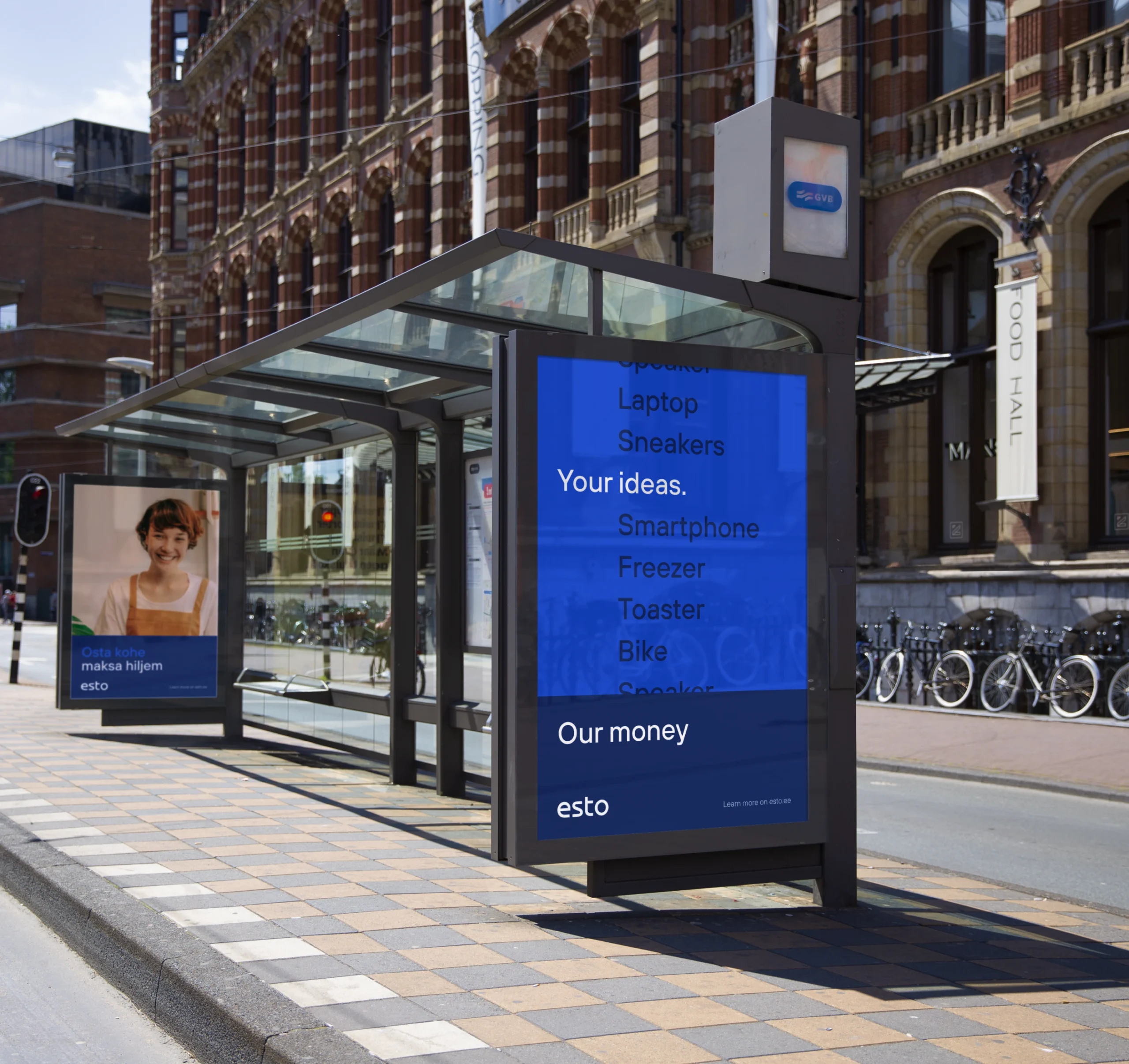
ESTO stands out for its innovative payment solutions catering to online and in-store commerce. Over four years, the company has established itself as a leading financial partner, including the largest retailers in the Baltic.
ESTO began its journey of a total rebranding where our team played a vital role in achieving the main objectives: revamping the brand identity to reflect its innovative spirit and creating a new website aligned with the company’s new identity, business objectives, and customer-focused approach.
The previous brand identity of the company could have effectively conveyed its innovative and visionary spirit.
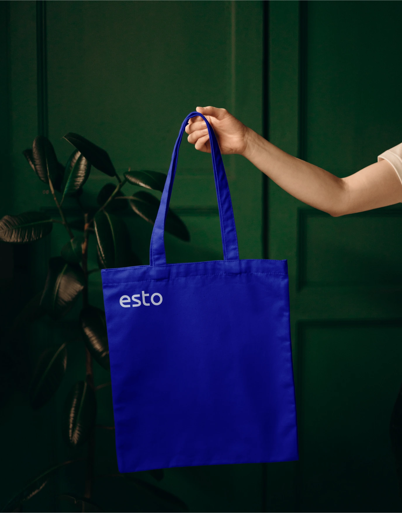
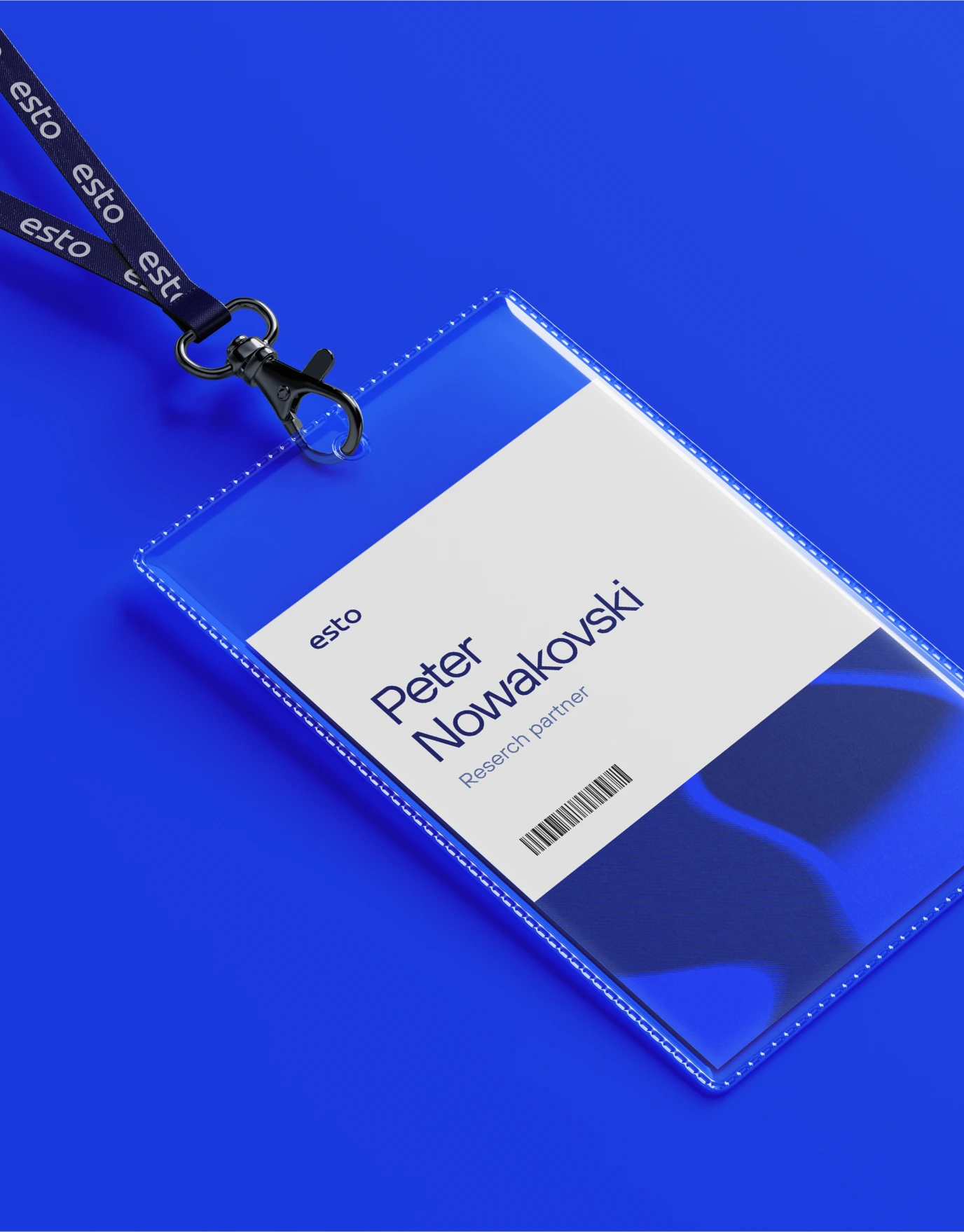
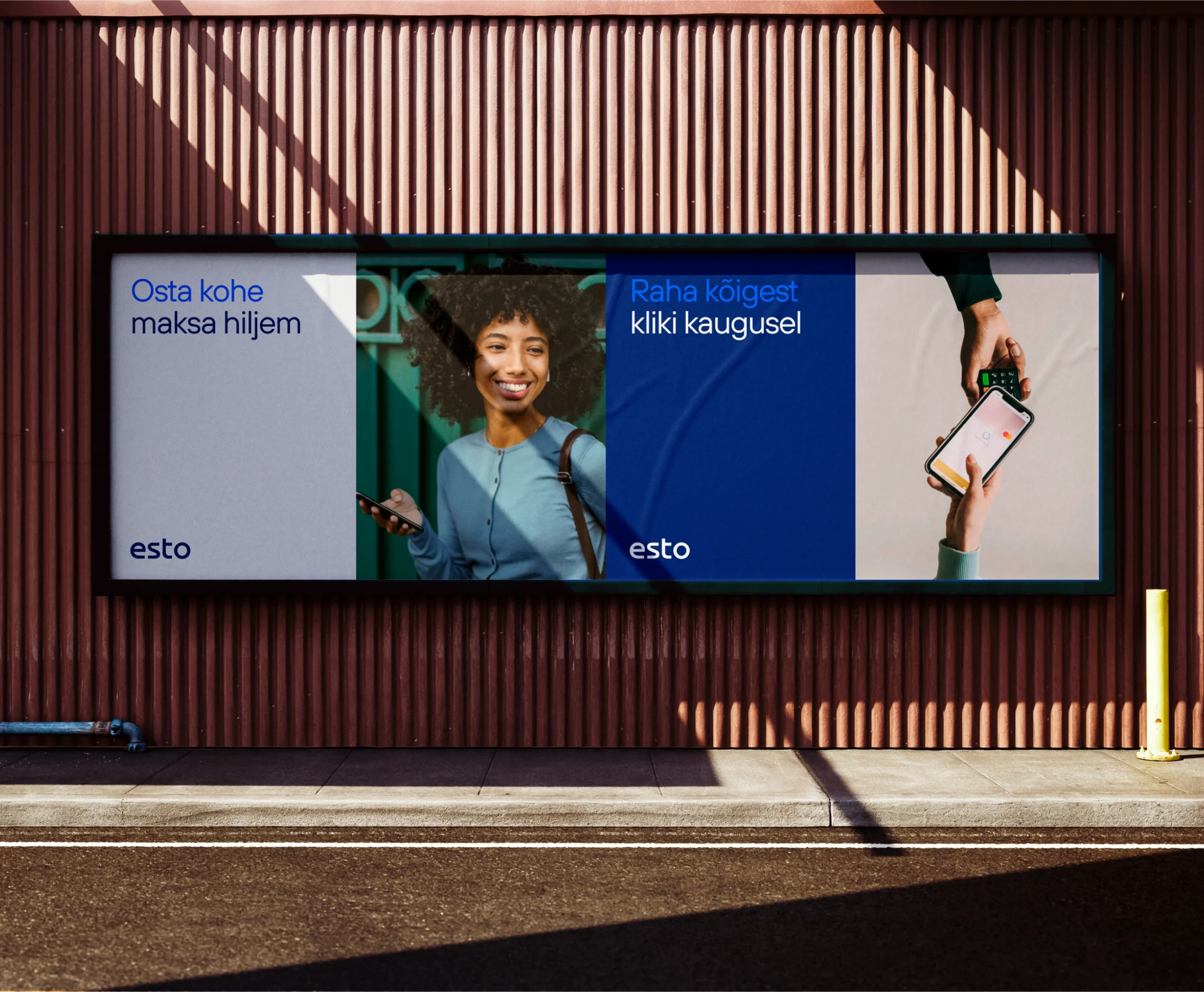
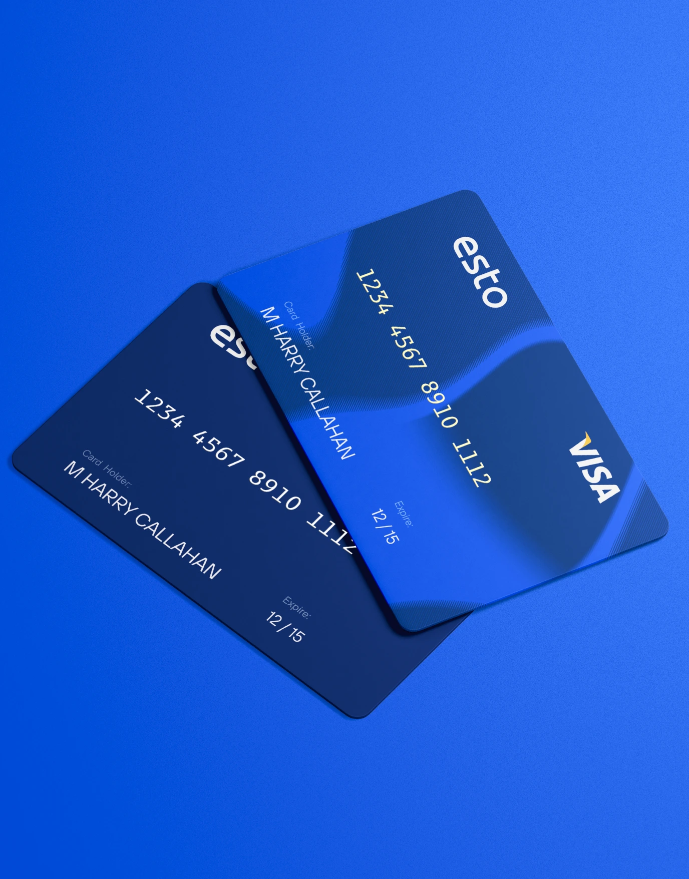
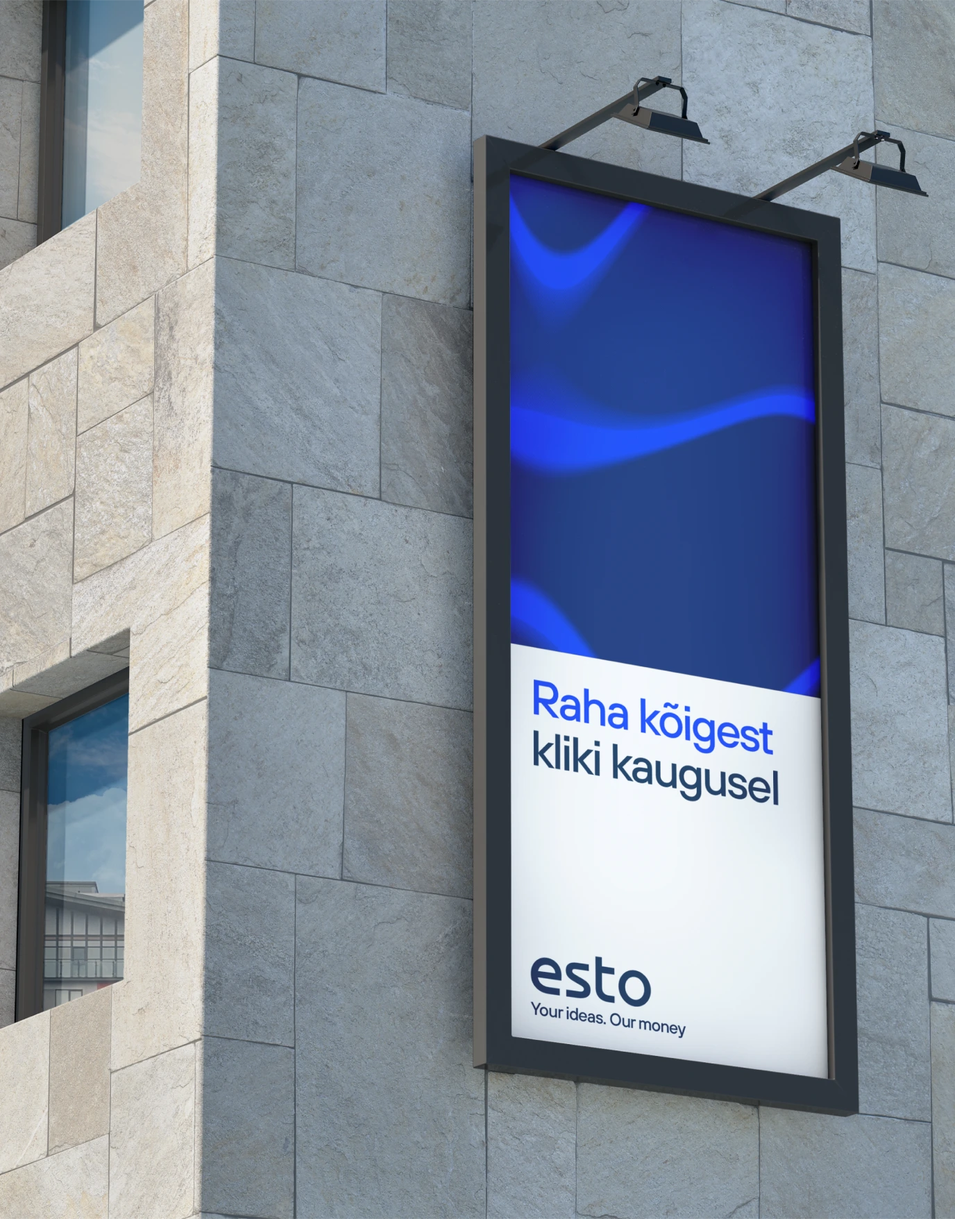
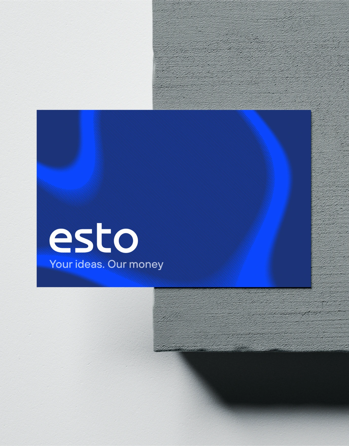
We have established and incorporated ESTO’s fundamental principles into the brand’s visual design. By developing a comprehensive guide for working with photos, logos, a brand book, and the website, we ensured consistency and maintained the mood of the identity throughout all touchpoints.
Together with the company team, we looked at the services, markets, types of users, and goals for a better vision of the future website. We decided that people’s interests should come first.
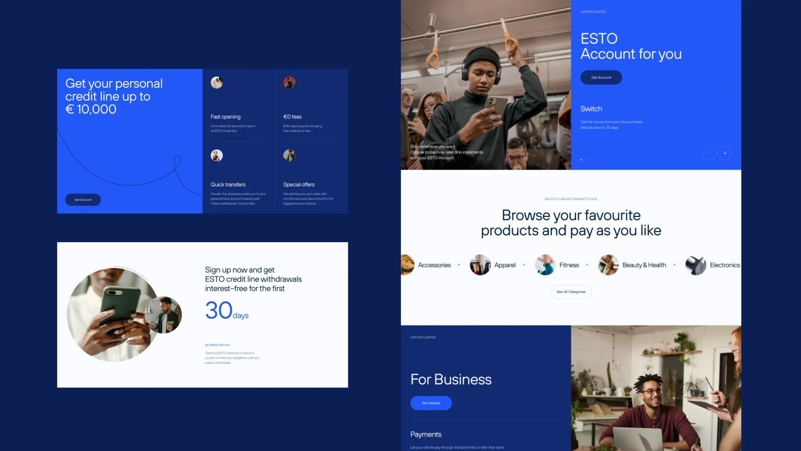
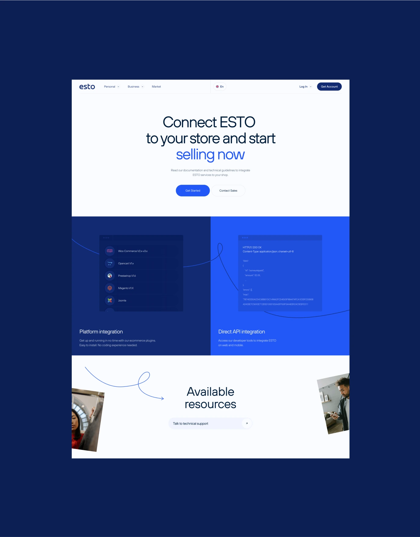
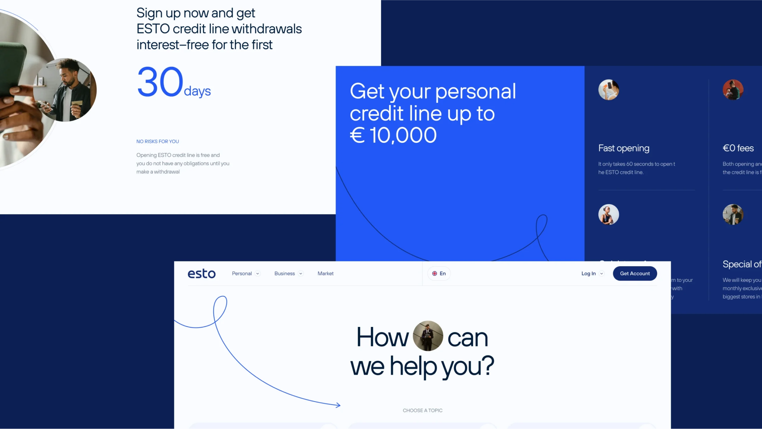
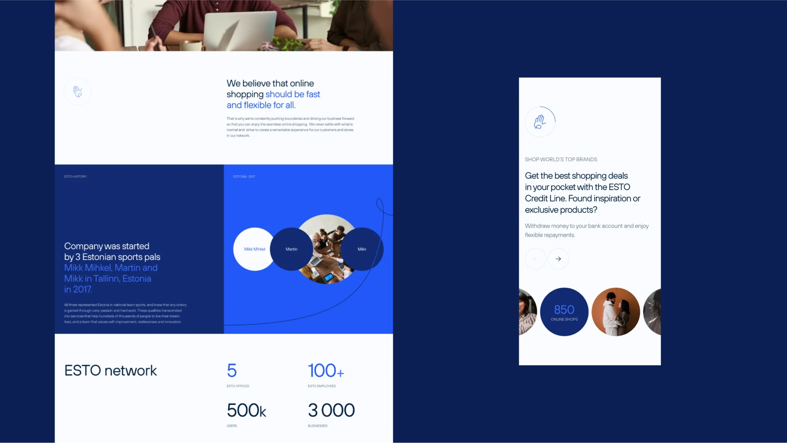
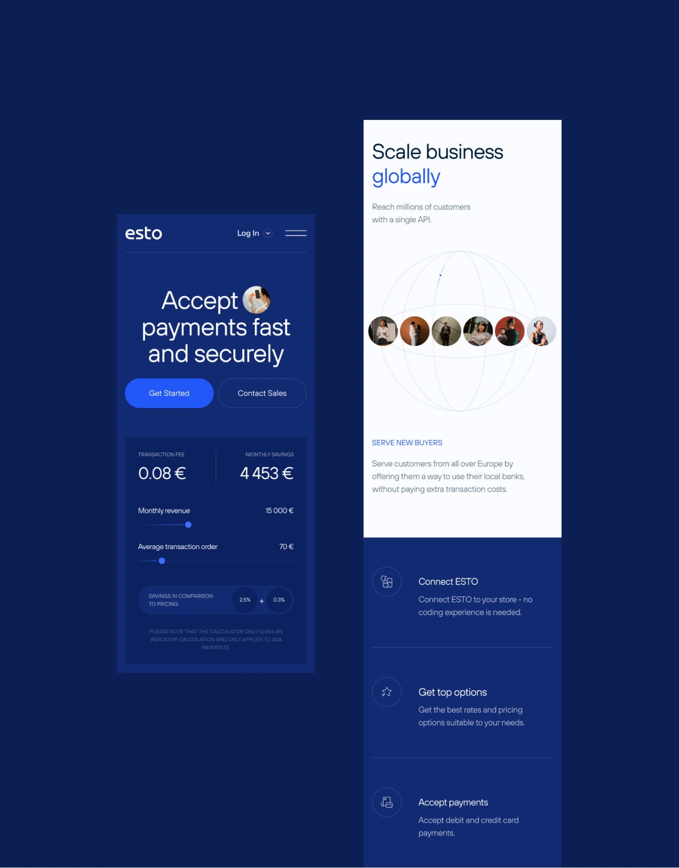
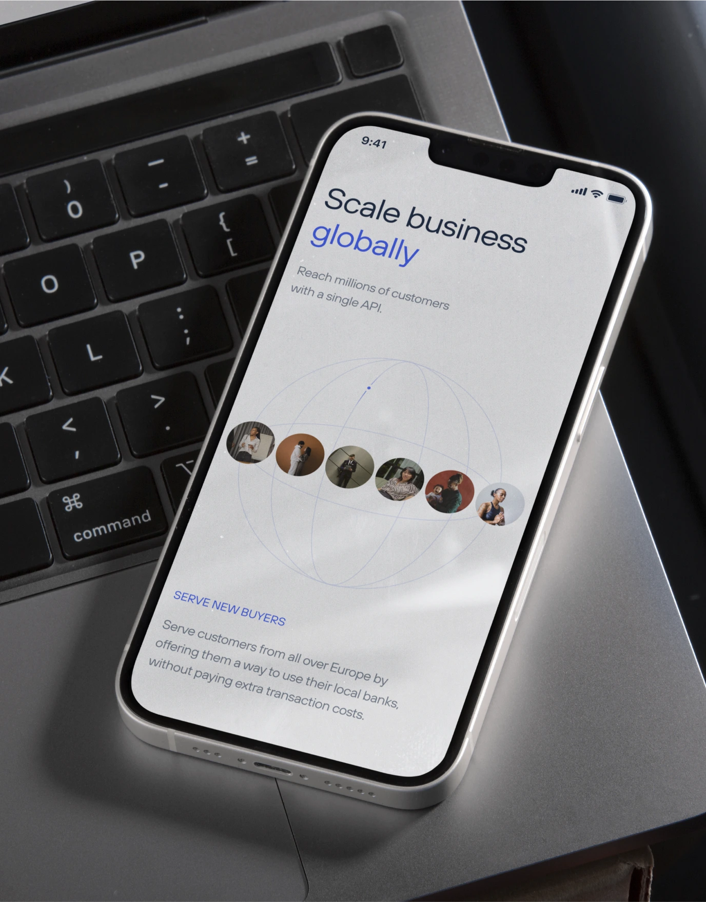
We aimed to ensure effortless navigation and easy access to services, the affiliate network, and the user portal. By separating and tailoring the products for different sectors, we ensured that users could find relevant information without confusion. The site’s design, characterized by responsive components, graphical prompts, and thoughtfully chosen photos, reflects a commitment to customer care and aligns with ESTO’s strategic objectives.
Lightness, transparency, and openness were inherent in the ESTO’s service and became the basis for their visual style, reflecting those traits on an emotional level.
The website is an organic evolution of the new company’s identity. And we ensured no gap between the site’s mood and the user experience. We wanted to care and openness to be read into the ease of user experience and approach to content. The platform now facilitates easy guidance for people from B2B and B2C in the company’s vast infrastructure.
We believe that the work accomplished will contribute to ESTO’s rise as the top partner network in the Baltics and expand into new markets. It brings us great joy to collaborate with these tech-savvy guys.


Credits
Sviatoslav Lablonskyi
Creative Direction
Irina Avtukhova
Creative Direction
Ivanna Boychuk
Creative Direction
Kyrylo Pryadko
Brand Strategy
Semen Mokrov
Graphic Design
Semen Mokrov
Creative Coding
Bohdan bbbbbgdn
Creative Coding
Vita Martsishauskaite
Web Design
Yelizaveta Kashchynets
Web Design
Yuliia Hnatkova
Project Management
