Transparent Network
Design of the website and visual identity for a project intended to make Ukraine’s business culture more open and attractive.

In collaboration with international partners, Ukraine’s financial community has developed an innovative payment system for secure and fast transactions. Prozora (Transparent, Ukrainian) Network is designed to set a new standard in the industry for economic growth and transparency, aiming to prevent non-transparent financial transactions.
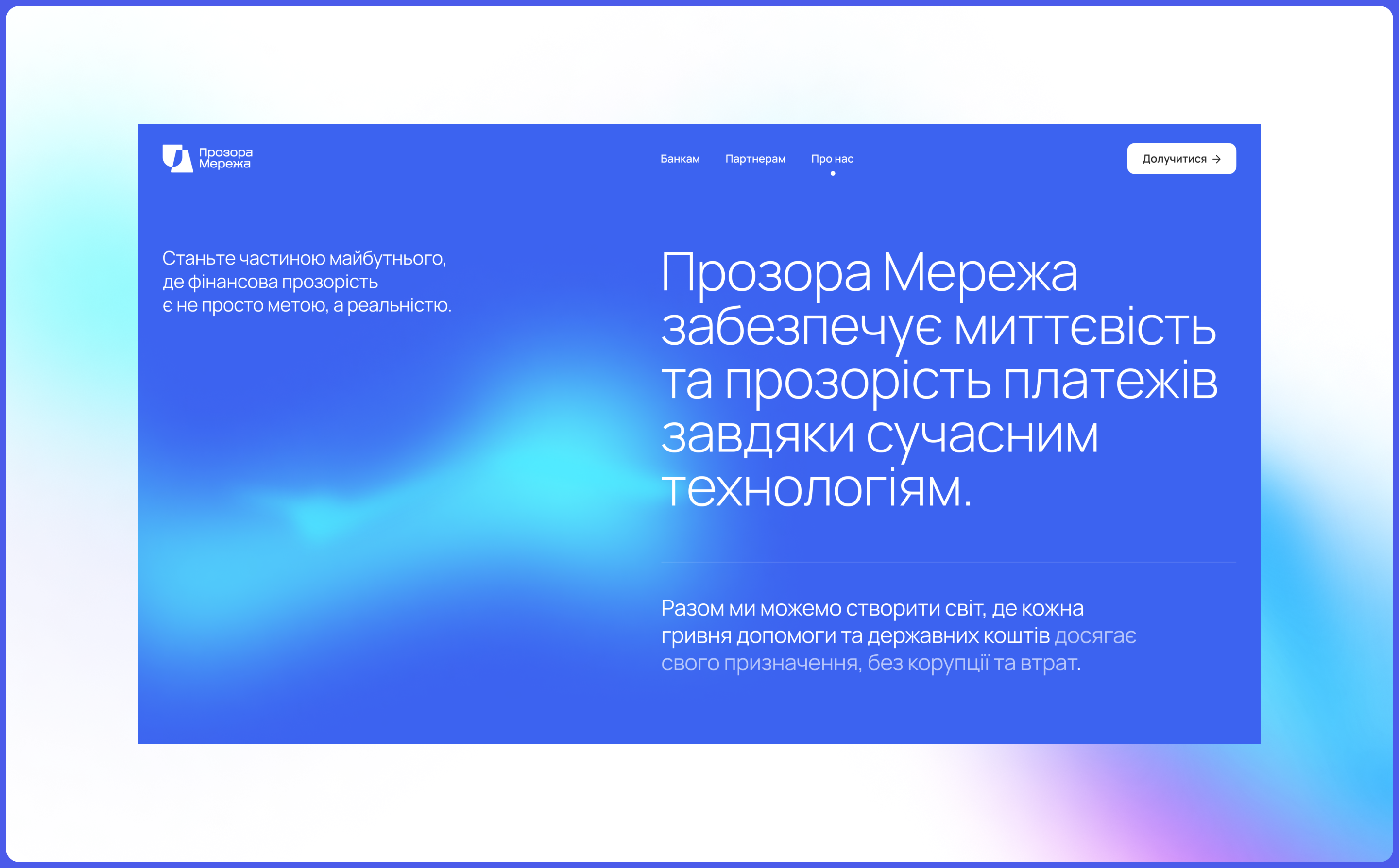
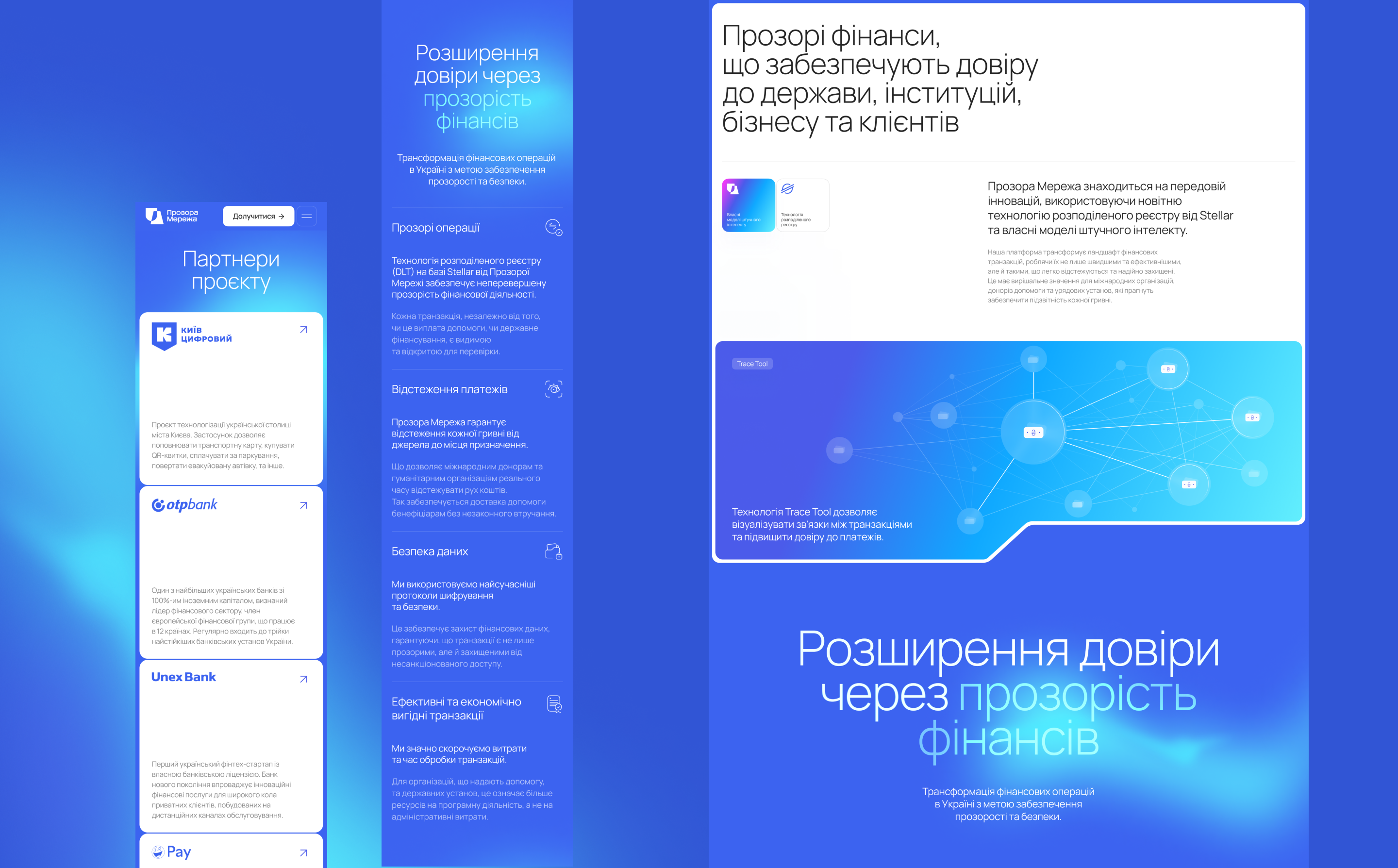
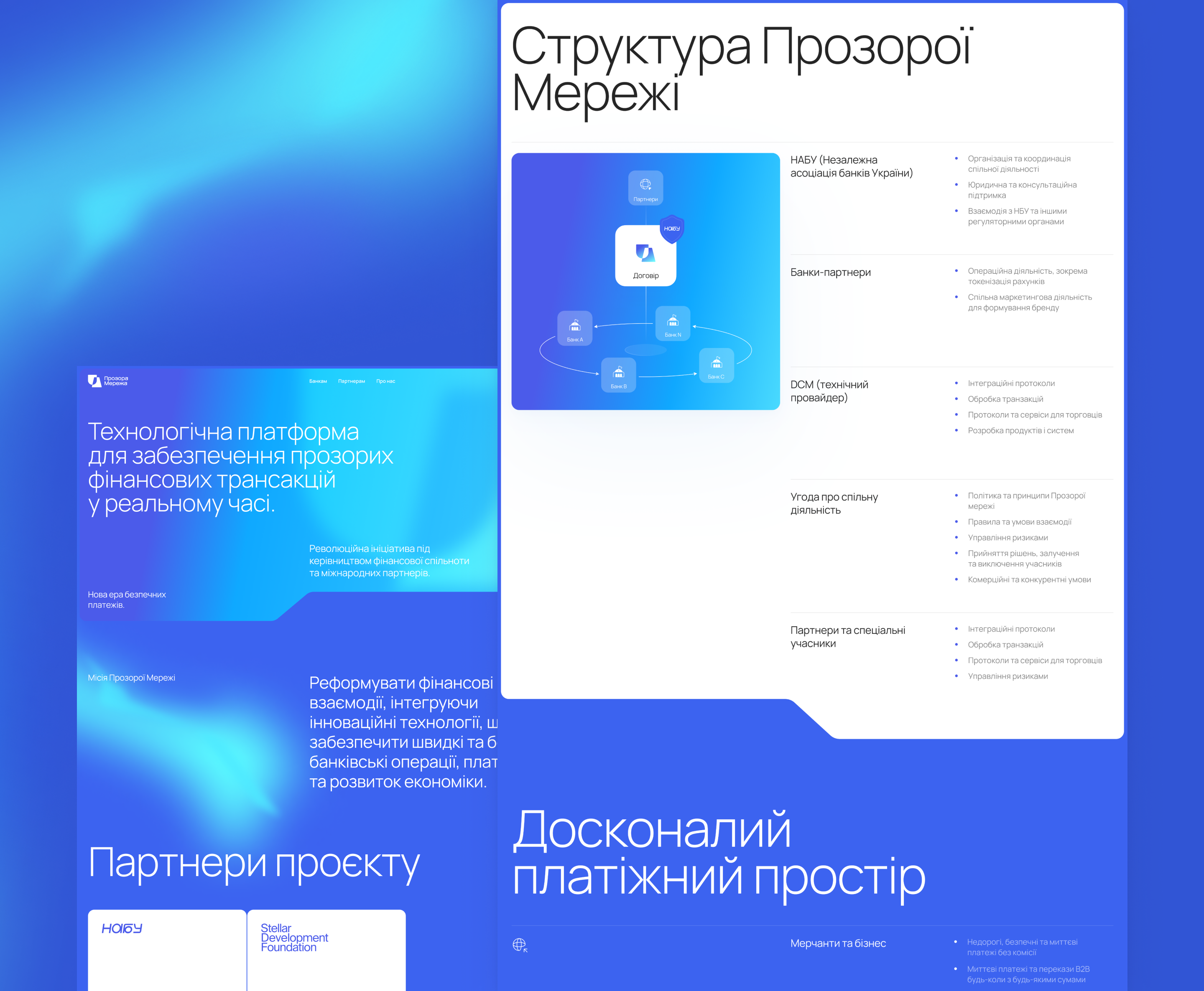
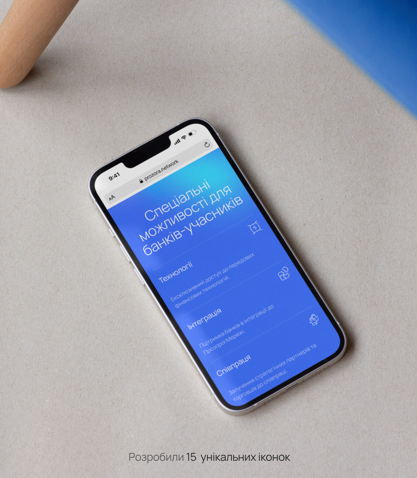
We developed an identity and website that fully discloses the project’s history, vision, and intentions.
Prozora Network’s team wanted it to be technologically advanced, expressive, accessible, and reliable.
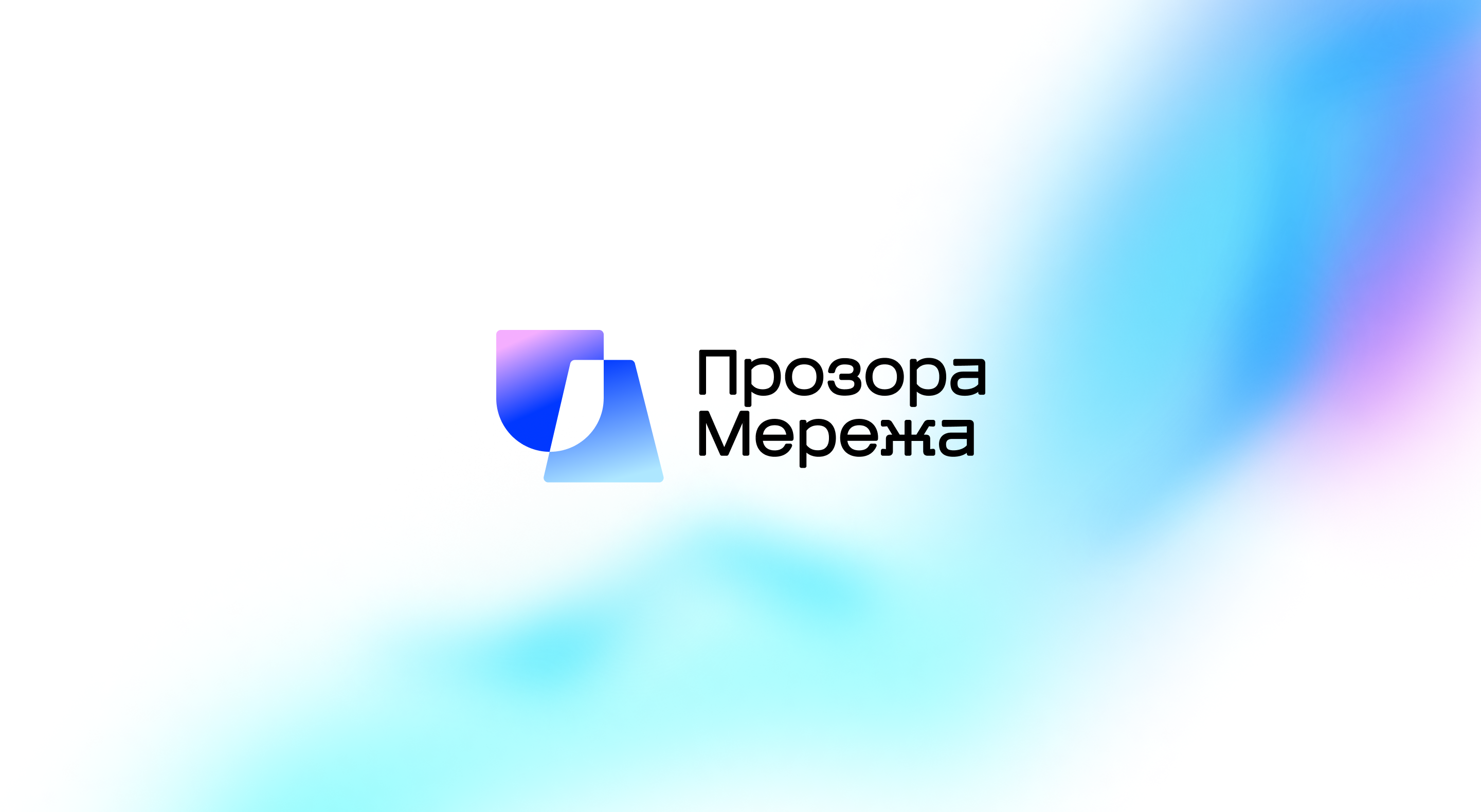
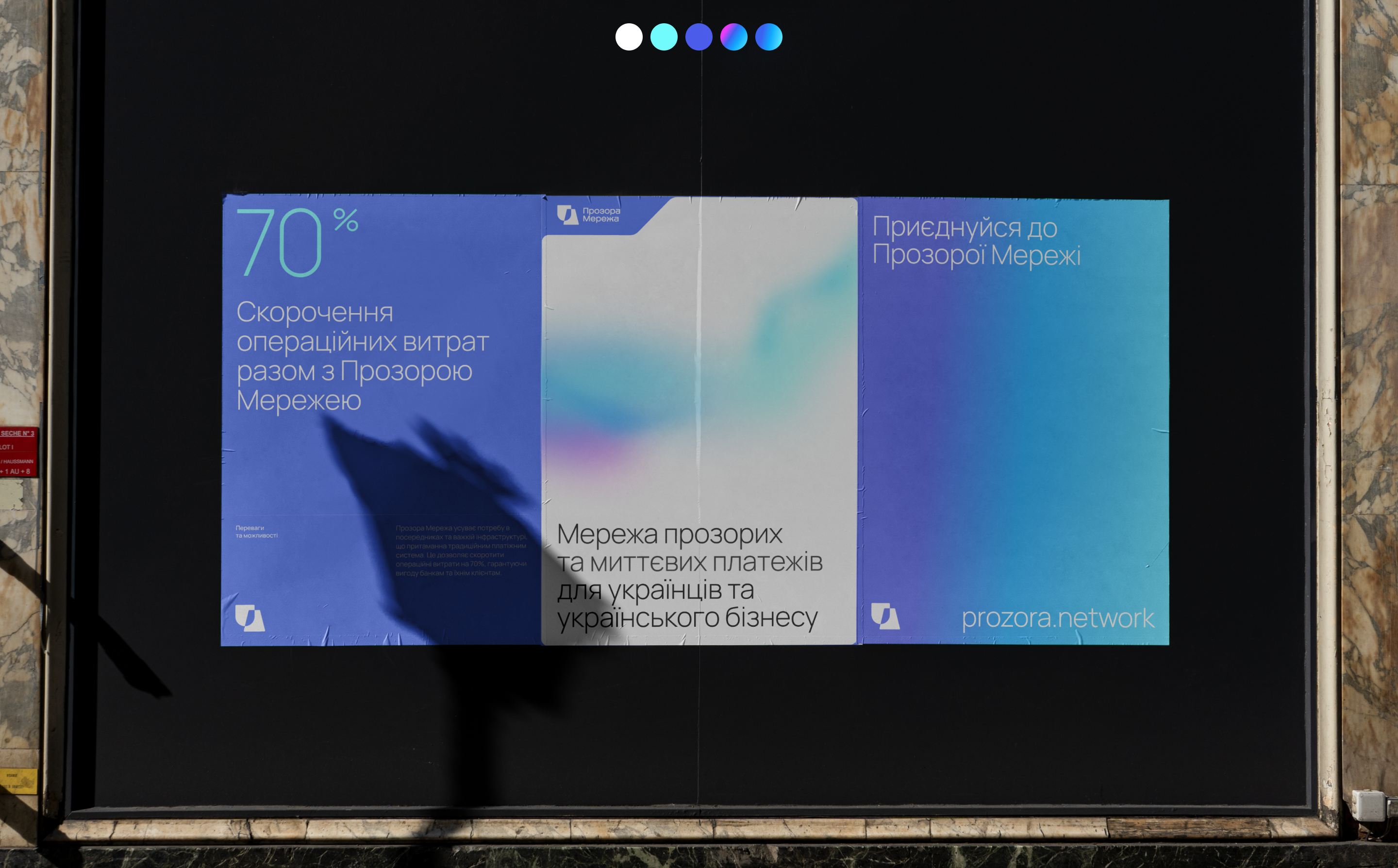
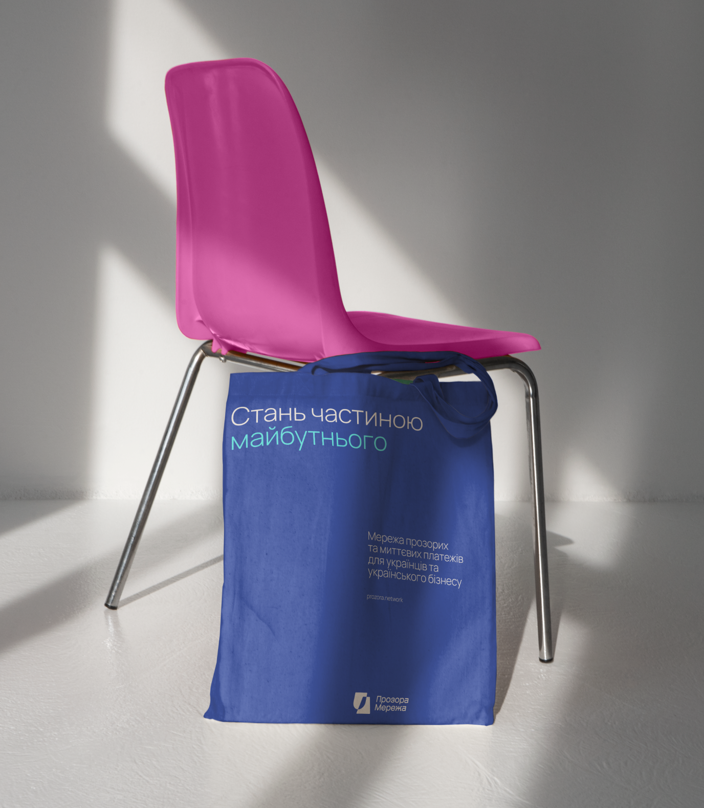
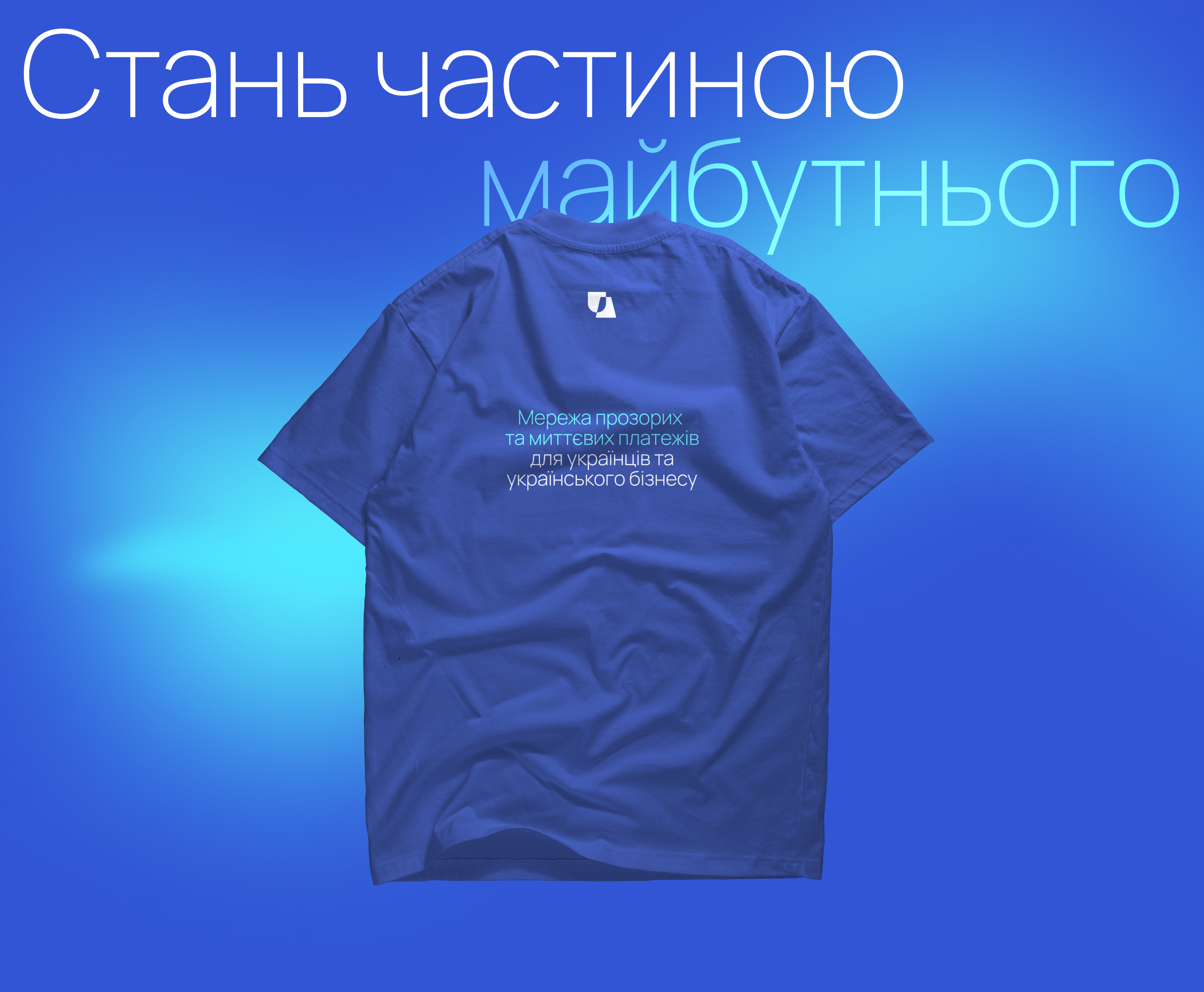
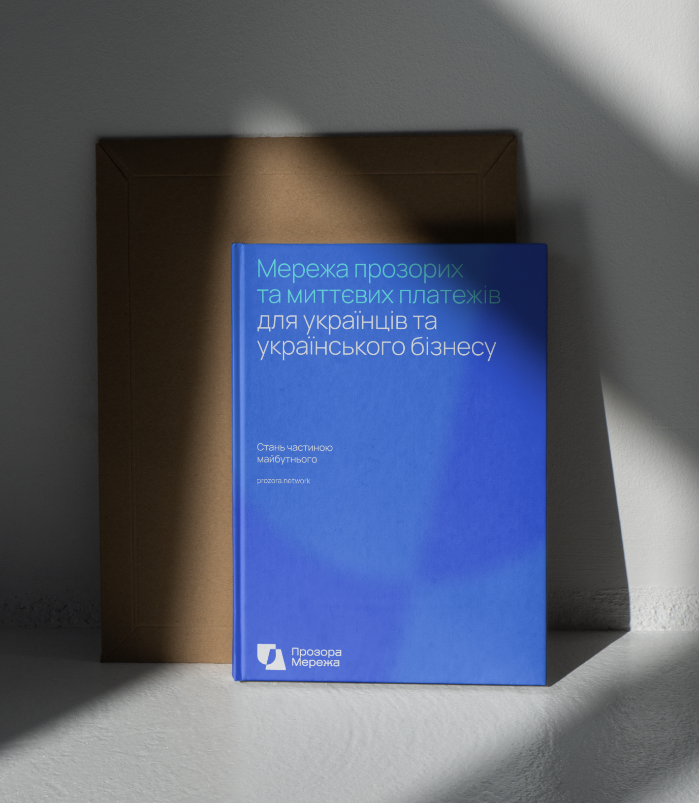
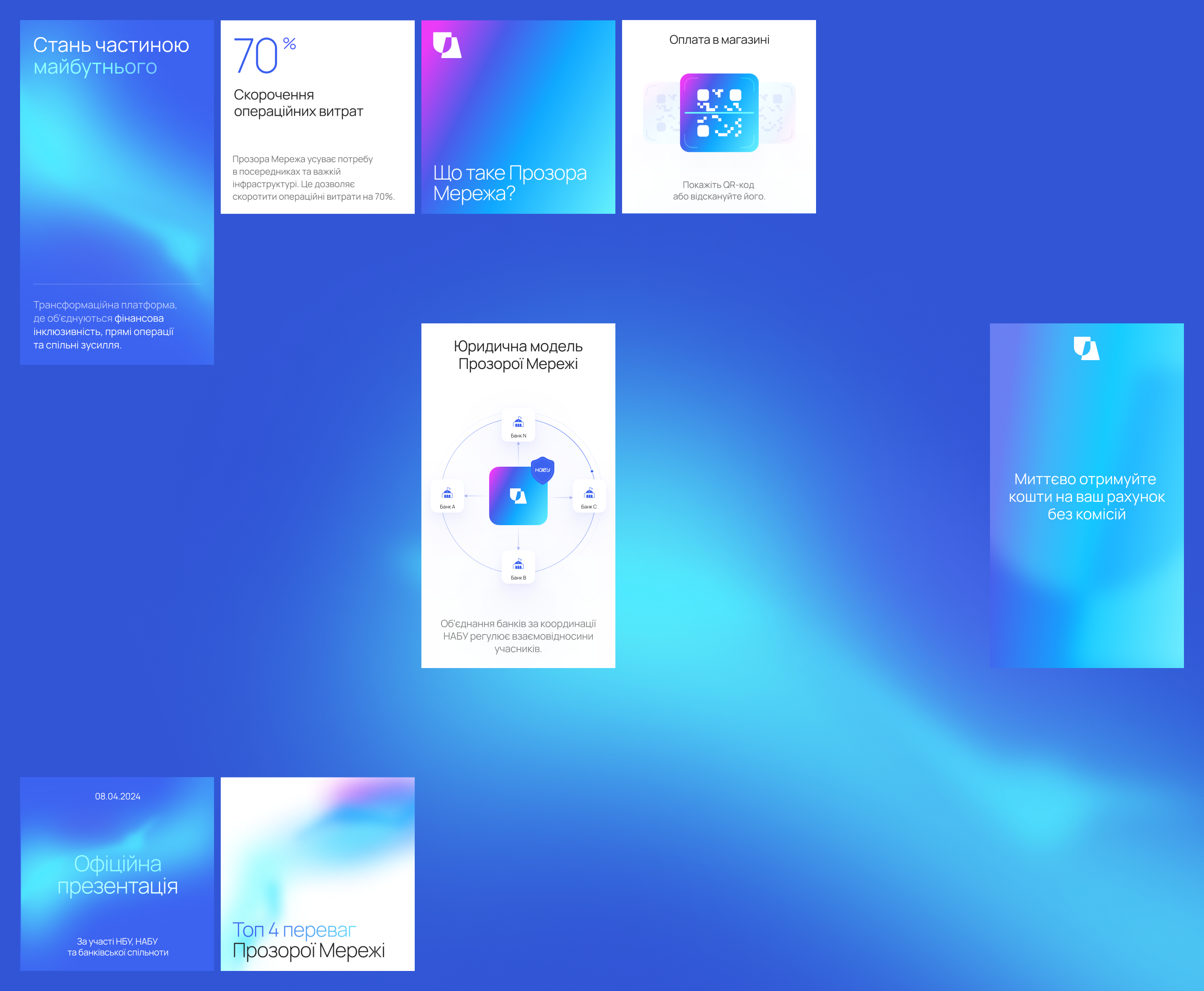
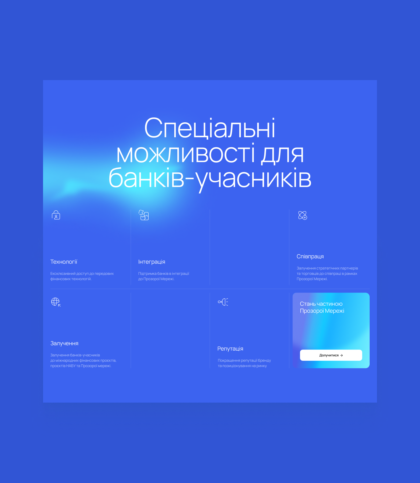
Our association with transparency became the center of identity, reinforced by the team’s requests. We suggested a vibrant blue color and derivative gradients that the team would use in various physical and digital media, creating a visually striking representation of our commitment to transparency.
The new logo is the Ukrainian code—the UA sign—to emphasize the focus of efforts and commitment to reforms in the country.
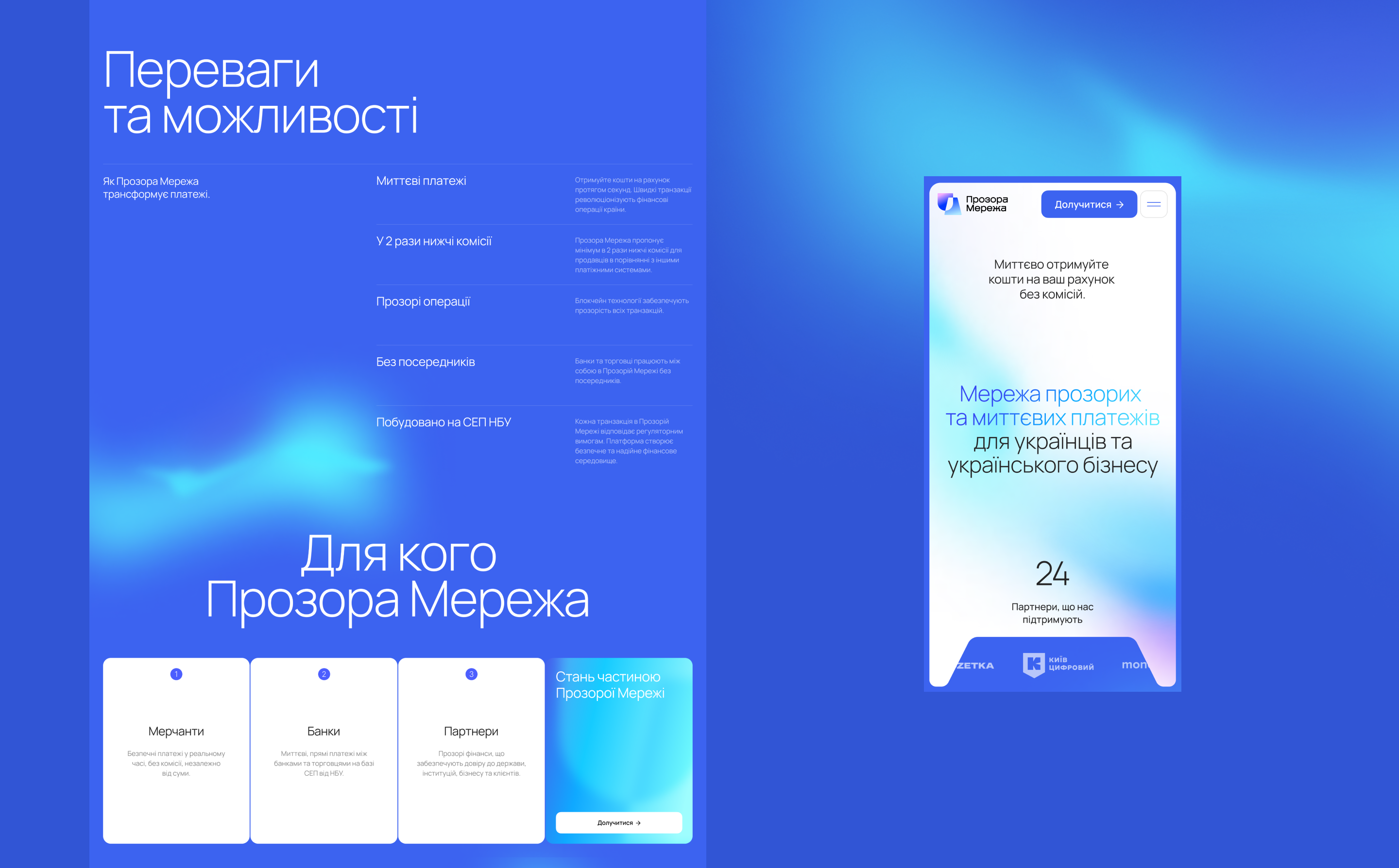
The large amount of information and the project’s multi-threaded nature required an understandable form. To this end, we designed their schemes and components in a consistent visual style.
The primary motive is transparency—something that gives understanding and justified expectations—manifested in the visual style, approach to content organization, and UX. Even the UI elements work with your expectations: for example, progress bars above the roadmap give you an idea of how many clicks are left to the end of the current story.
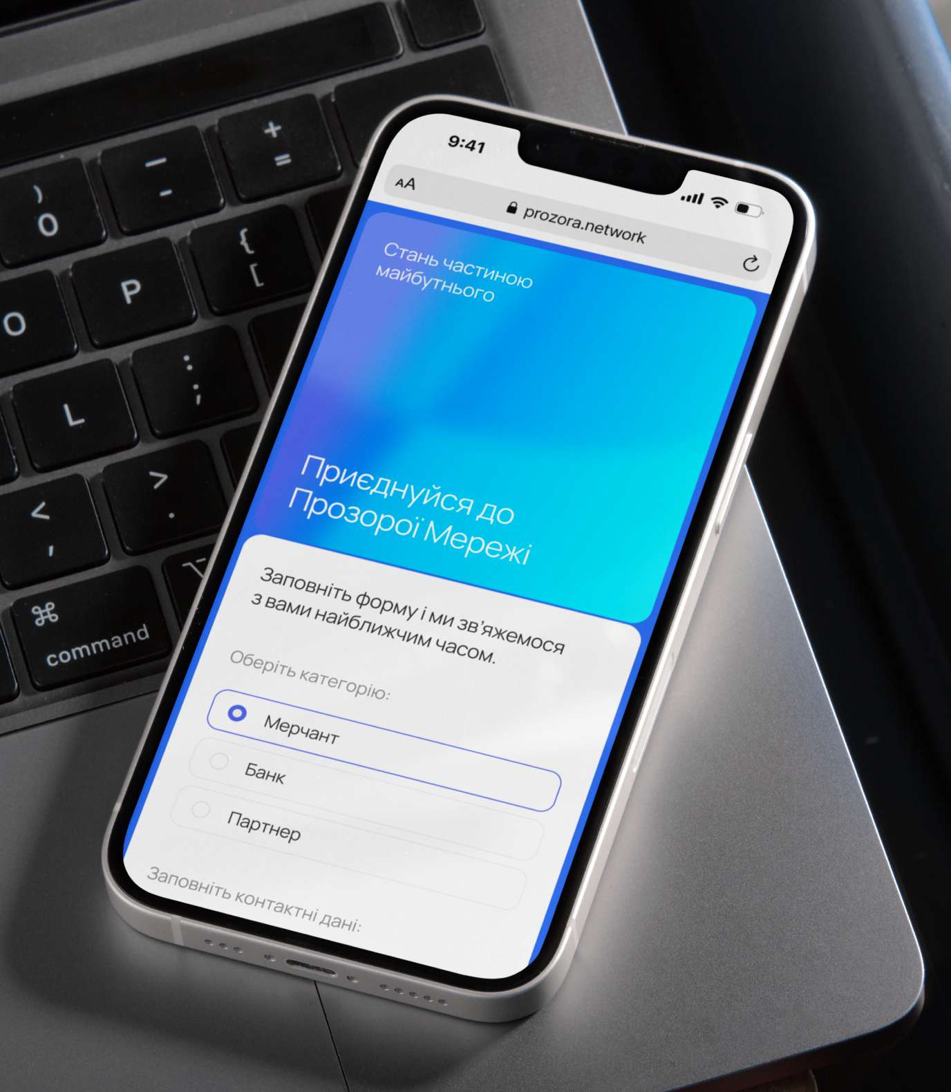
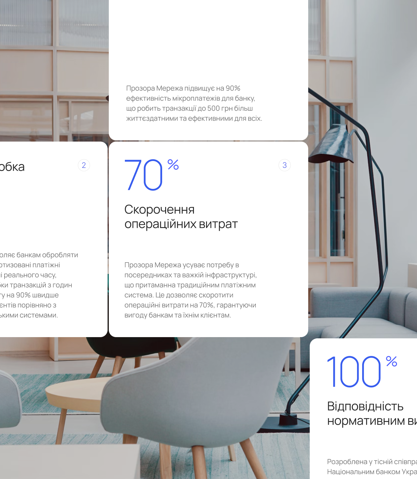
For Prozora Network, we designed a light, open, and accessible style that represents the product’s potential to transform a business culture.
Credits
Max Tishchenko
Art Direction
Andrij Kurochkin
Graphic Design
Vita Martsishauskaite
Web Design
Anatolii Shovkovyi
Development
Yuliia Hnatkova
Project Management
