


Shorely
Services
Brand
Industry
Oil Transport, Logistics
The brand identity with playful tones and slight self-irony
Shorely is entering the challenging oil transportation market. We developed a brand that enables the company to compete with industry giants and stands out with a fresh, slightly ironic style—breaking away from established players’ restrained and often uninspiring identities.
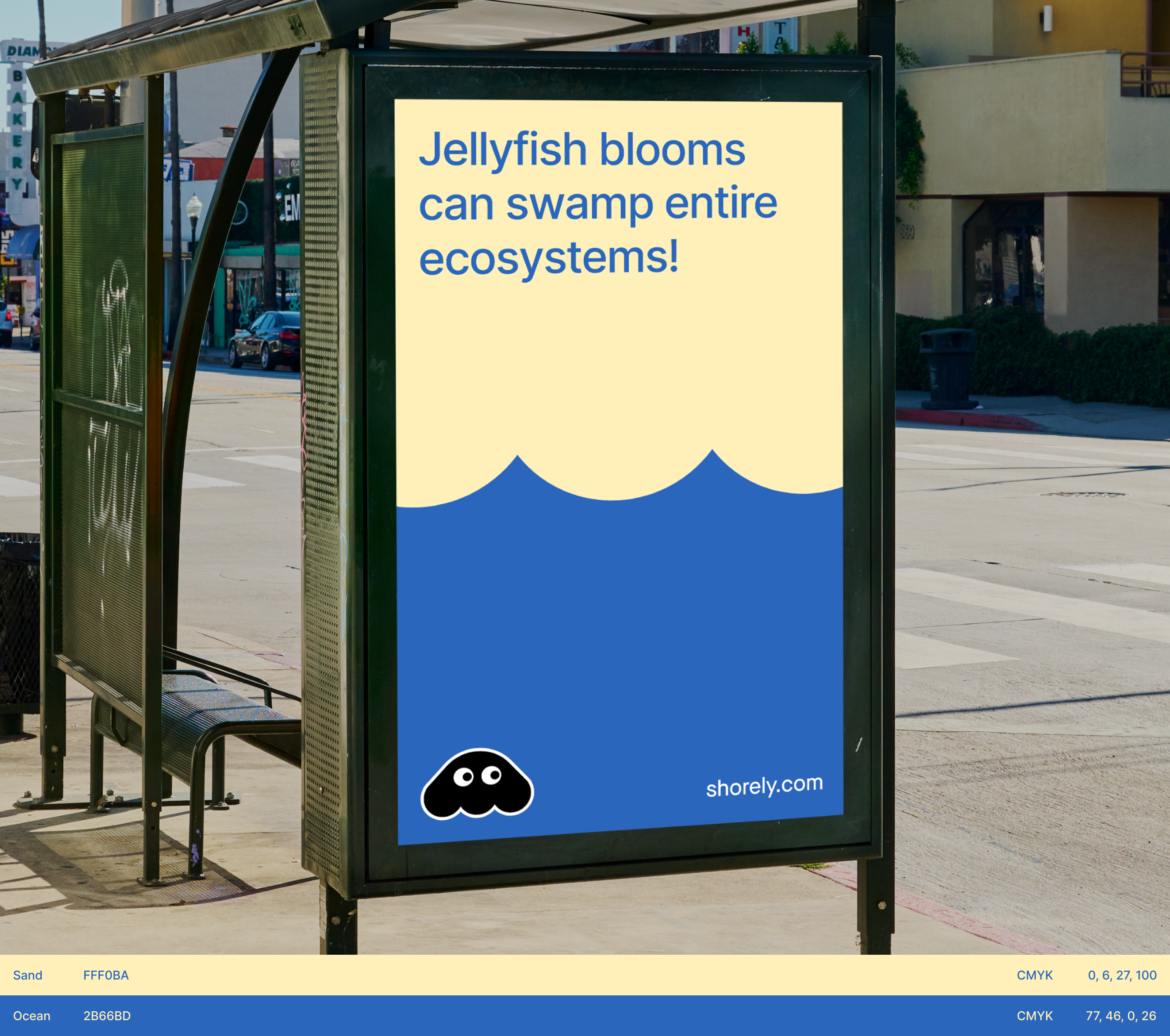
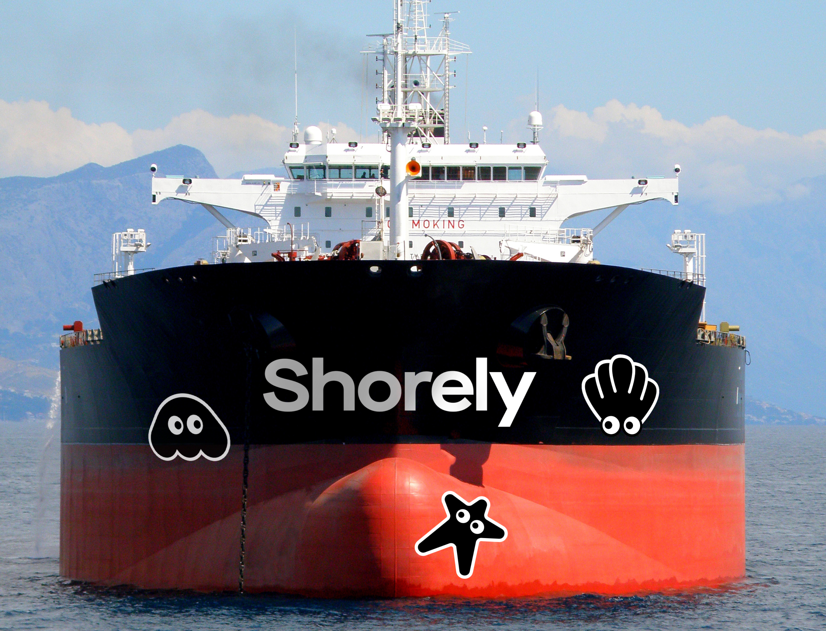
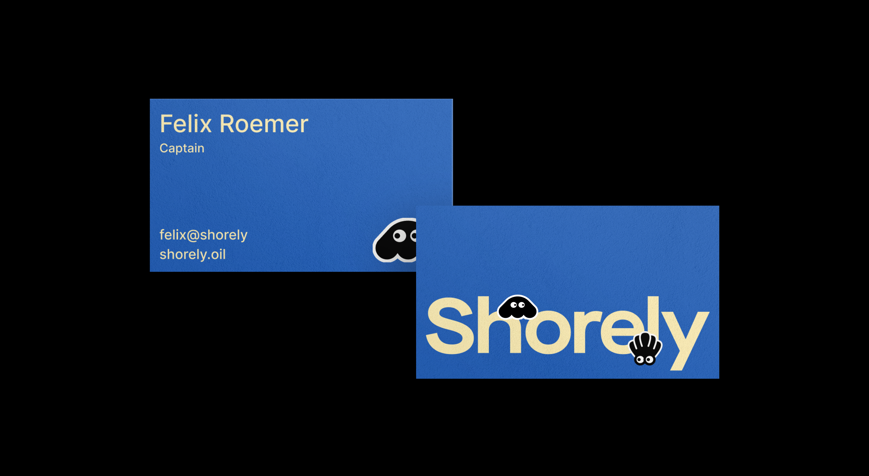
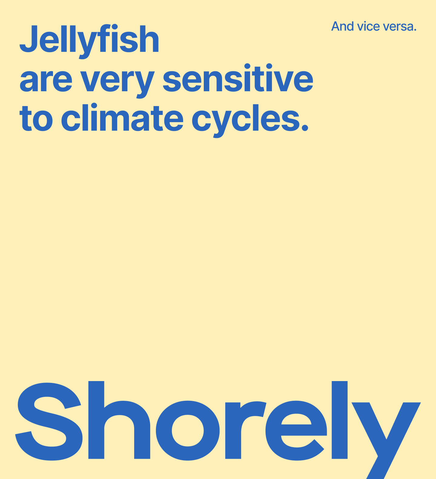
The brand features blue and yellow, symbolizing the sea and sand, alongside playful visual elements like jellyfish silhouettes and oil slicks, adding a touch of irony to its image.
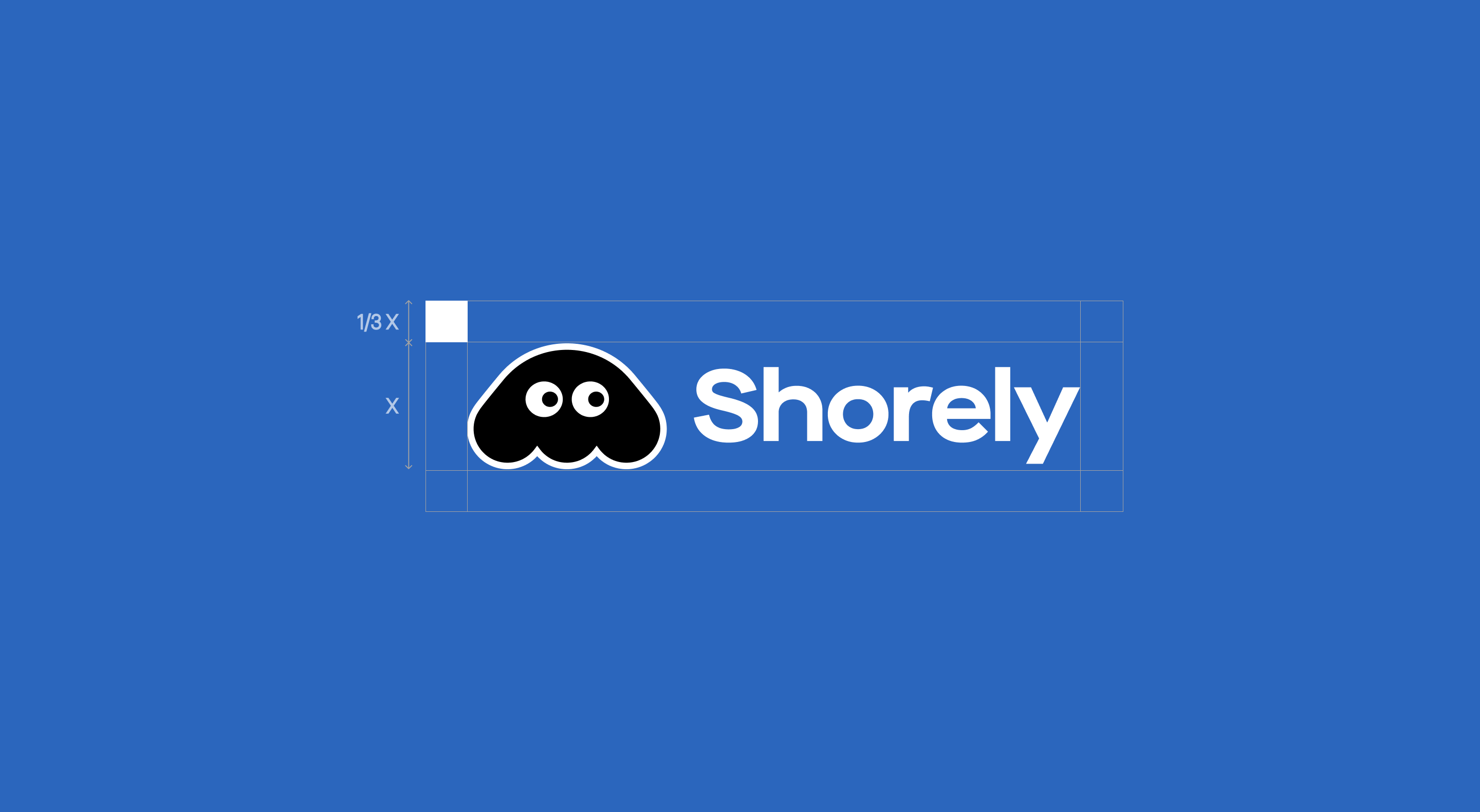
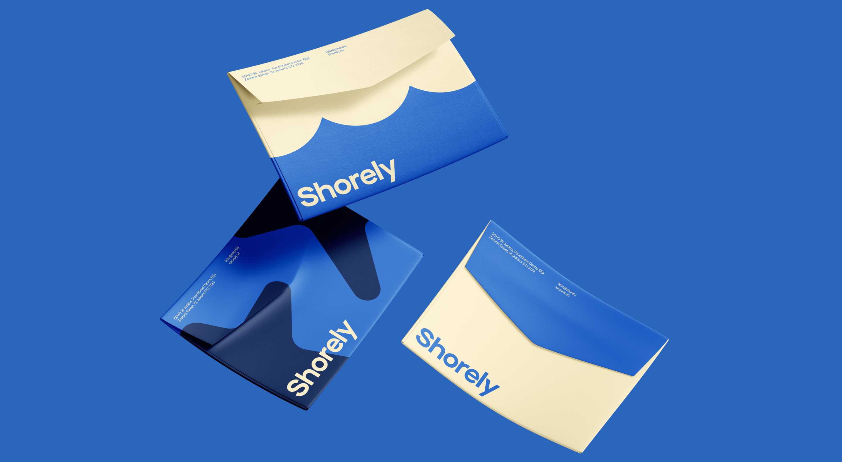
For Shorely, we designed a flexible set of visual assets that could be assembled into various compositions. When scaled, the jellyfish silhouette transforms into wave patterns, becoming a distinct brand element.
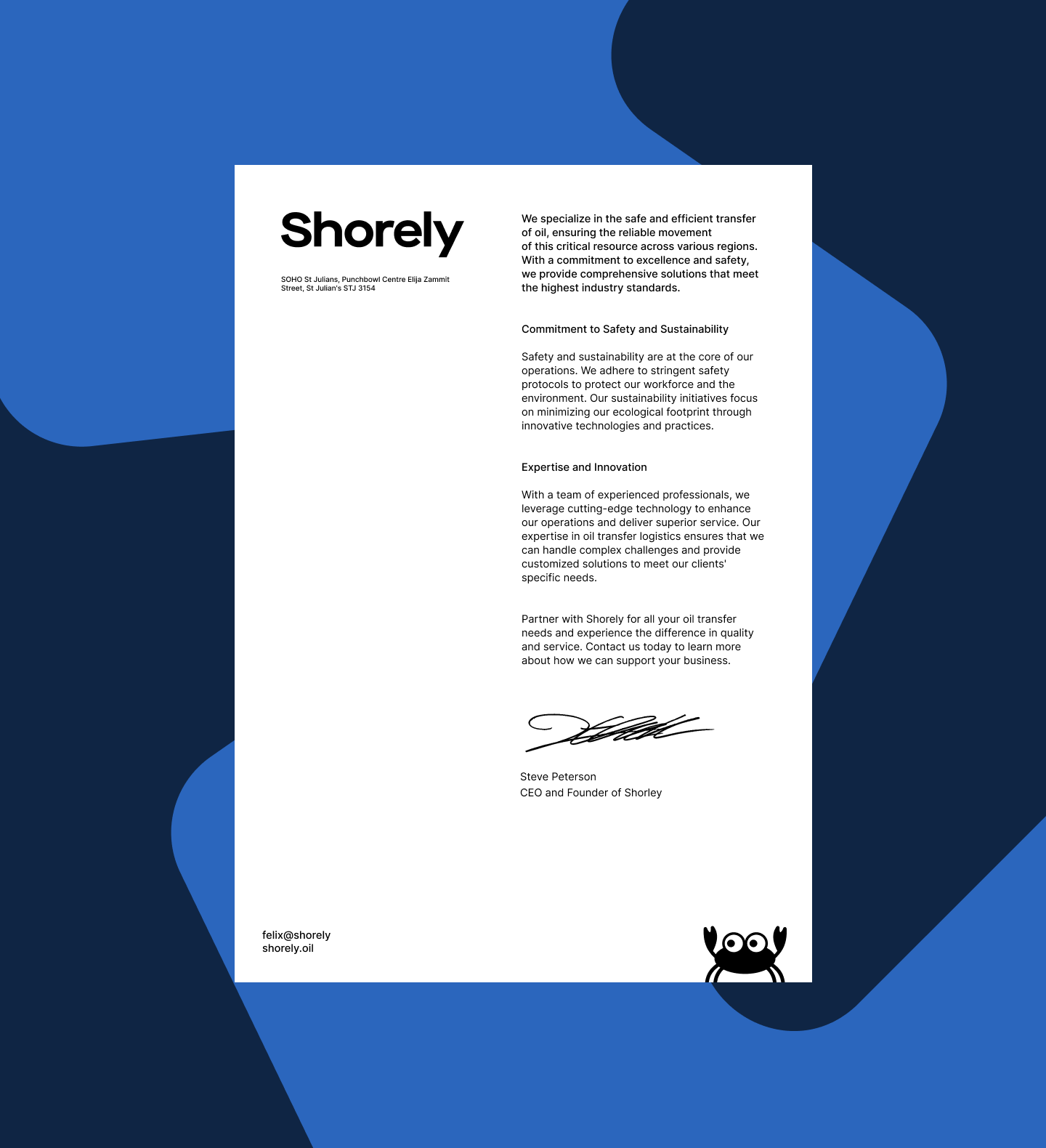
We demonstrated how the identity works across corporate merchandise and on the company’s ships. The brand adapts seamlessly to different formats and needs while maintaining its bold and vibrant presence.
Shorely’s brand identity is dynamic and playful. It reflects the values of the new generation entering the industry. This generation values sustainability and is open to unconventional solutions, and our brand identity resonates with these principles.

Credits
Sviatoslav Iablonsky
Art Direction
Anatolii Todorov
Graphic Design
Taia Yurkiv
Motion Design
Yuliia Hnatkova
Project Management