


Relokia
Services
Brand
Industry
IT, Data Migration
Concise branding for a data migration service company.
Since its founding, Relokia, a globally recognized data migration automation service, has not changed its brand identity.
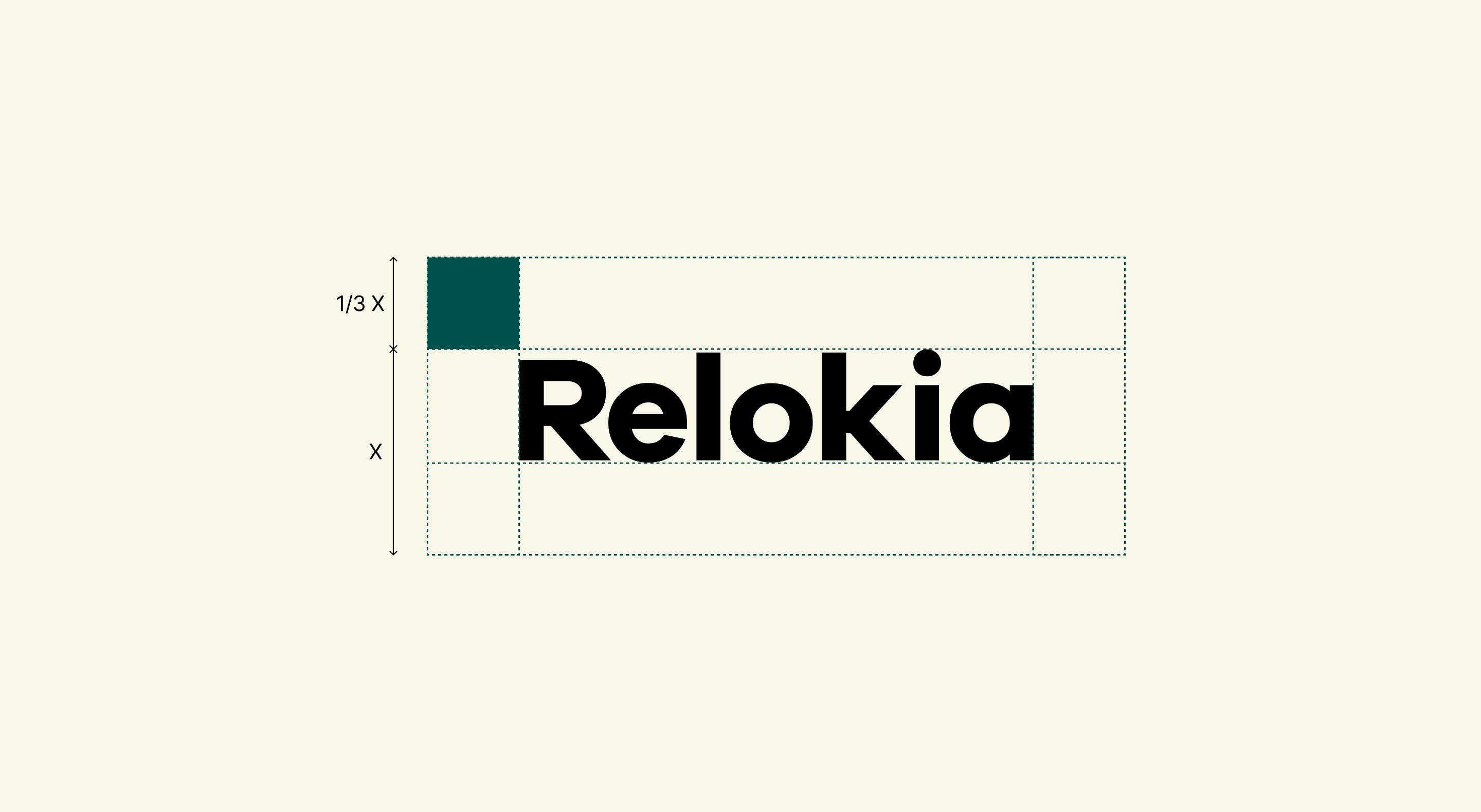
We developed a compelling brand system and logo that preserves the critical concept of incorporating the initial letters of the founders’ names into the symbol.
In collaboration with the C-level team, we envisioned a future identity that is simple, versatile, and balanced between playful and serious.
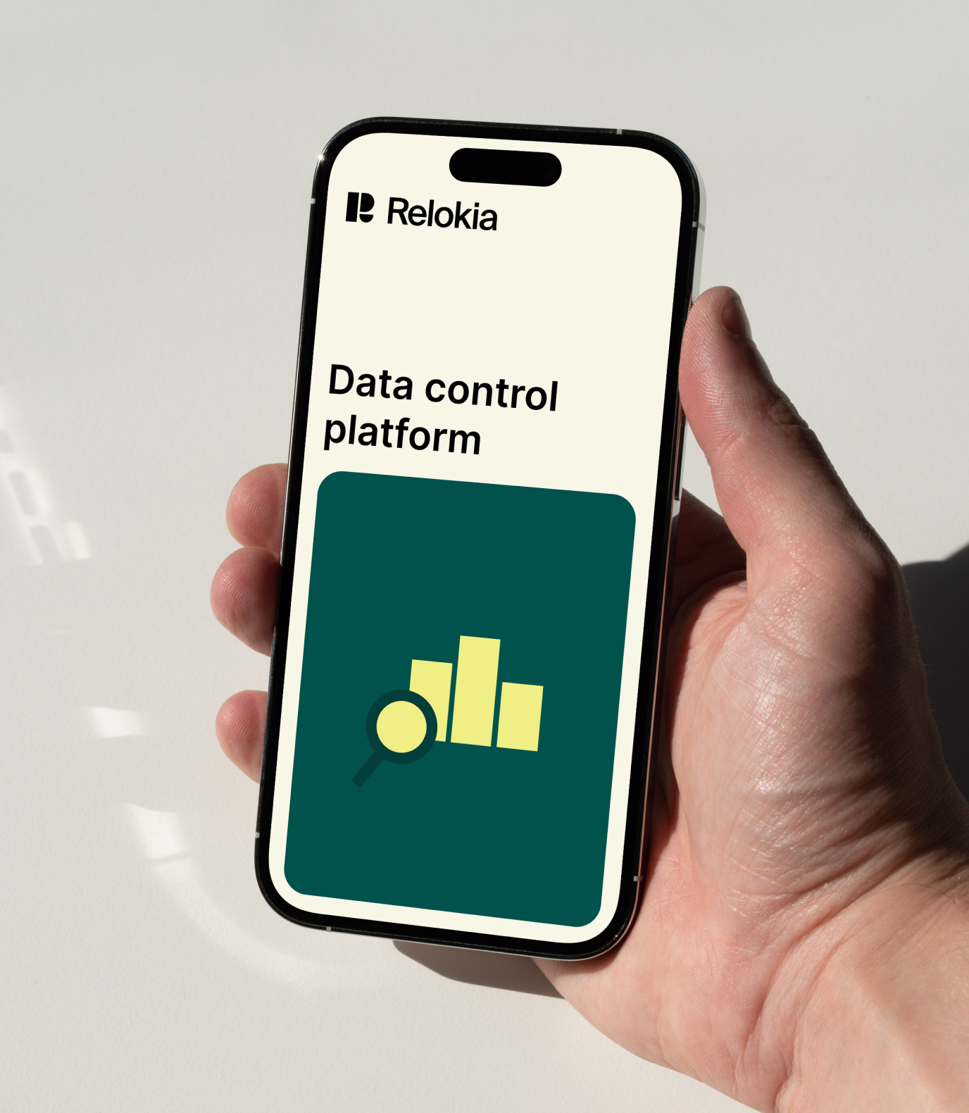
The new system, which is easy to use and meaningful, provides variety.
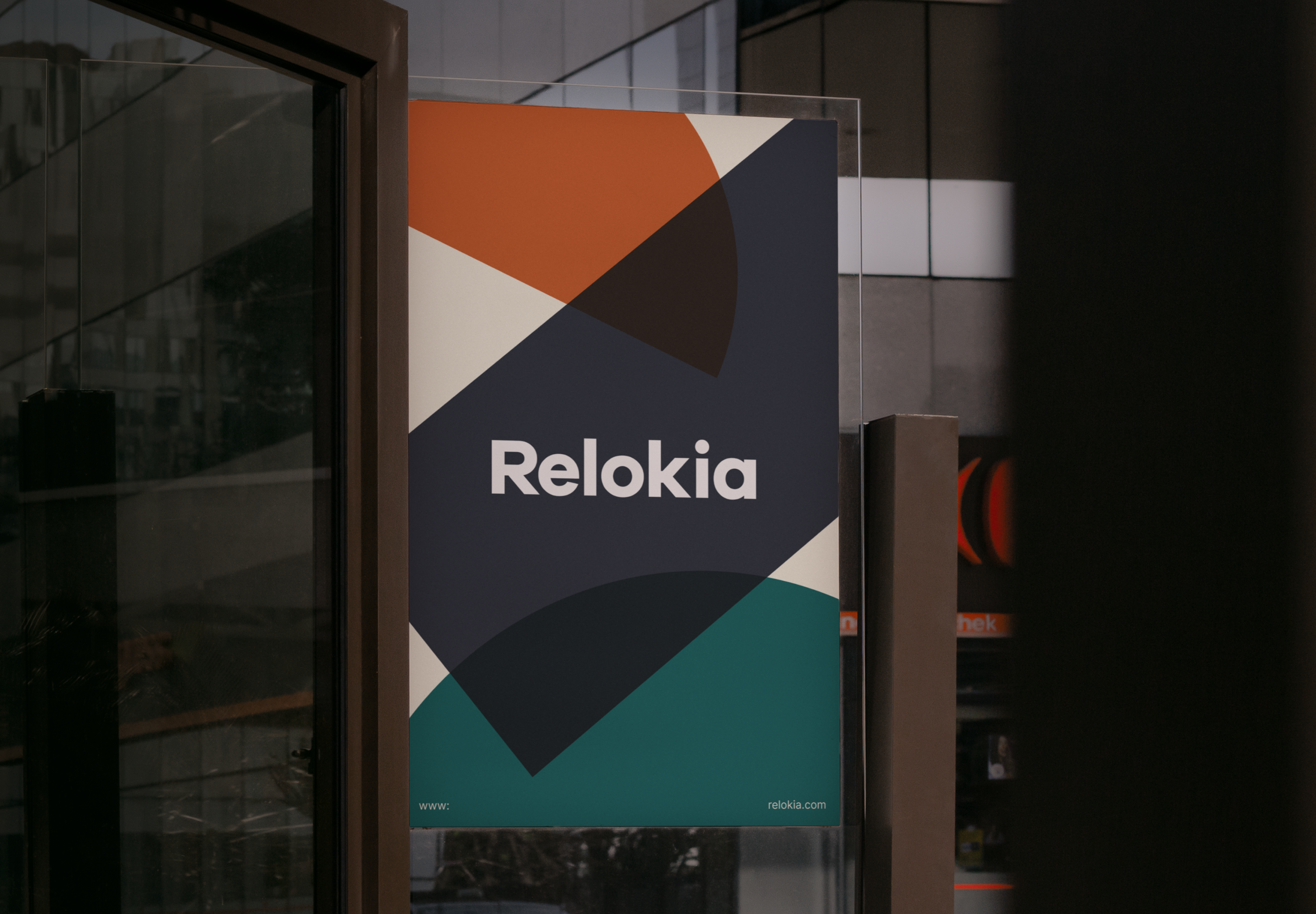
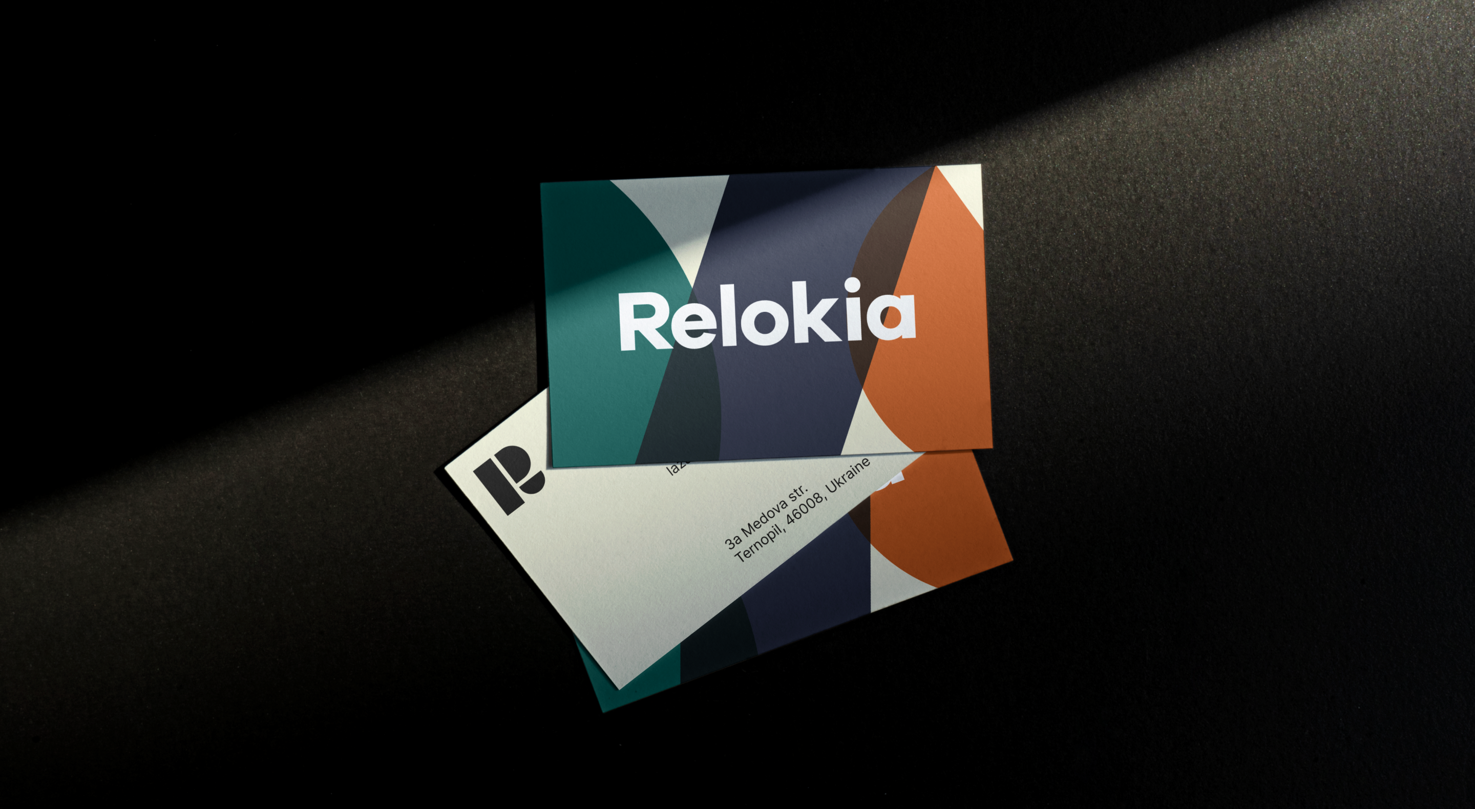
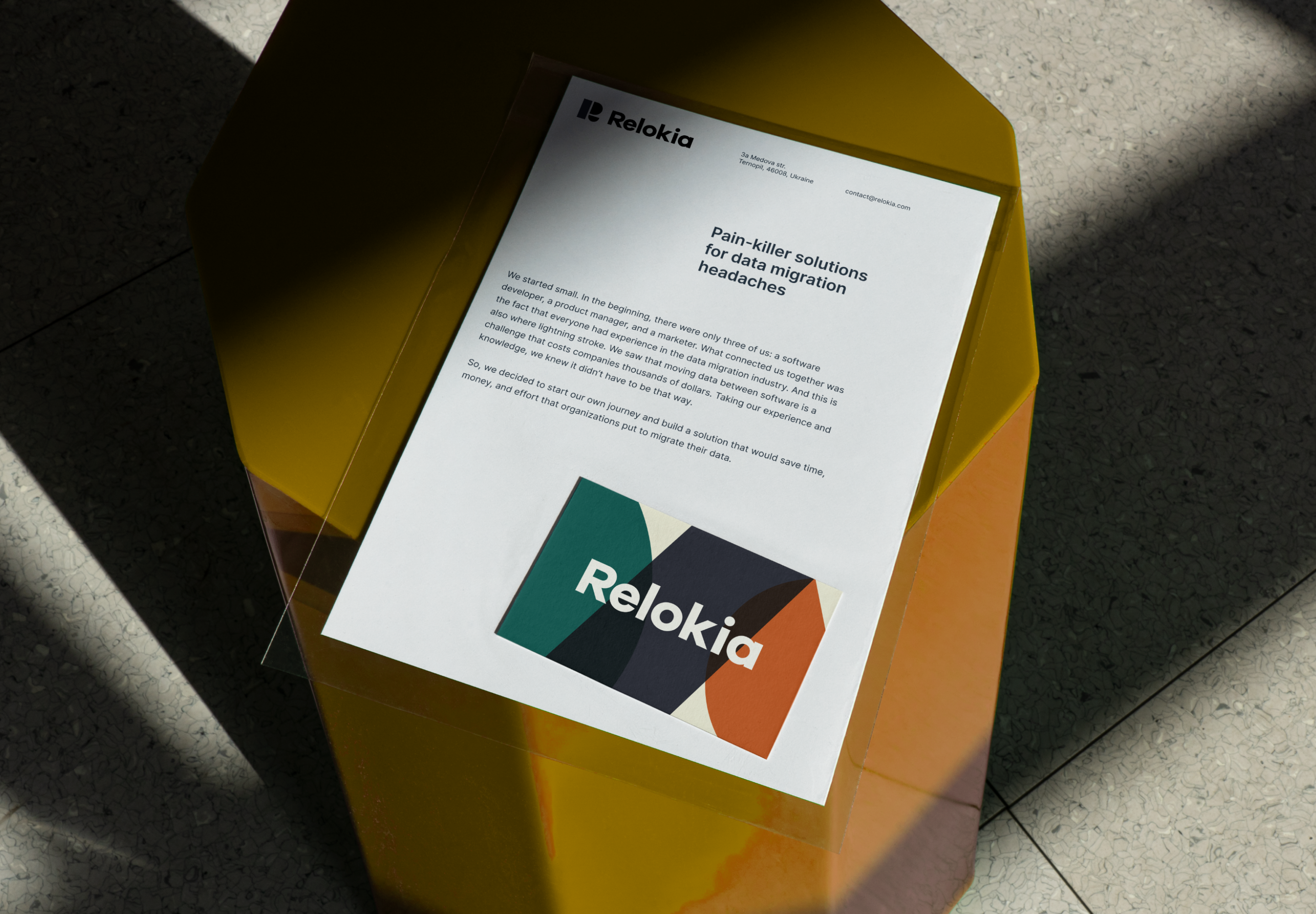
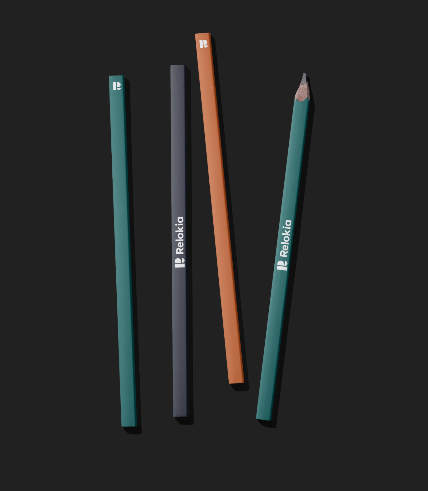
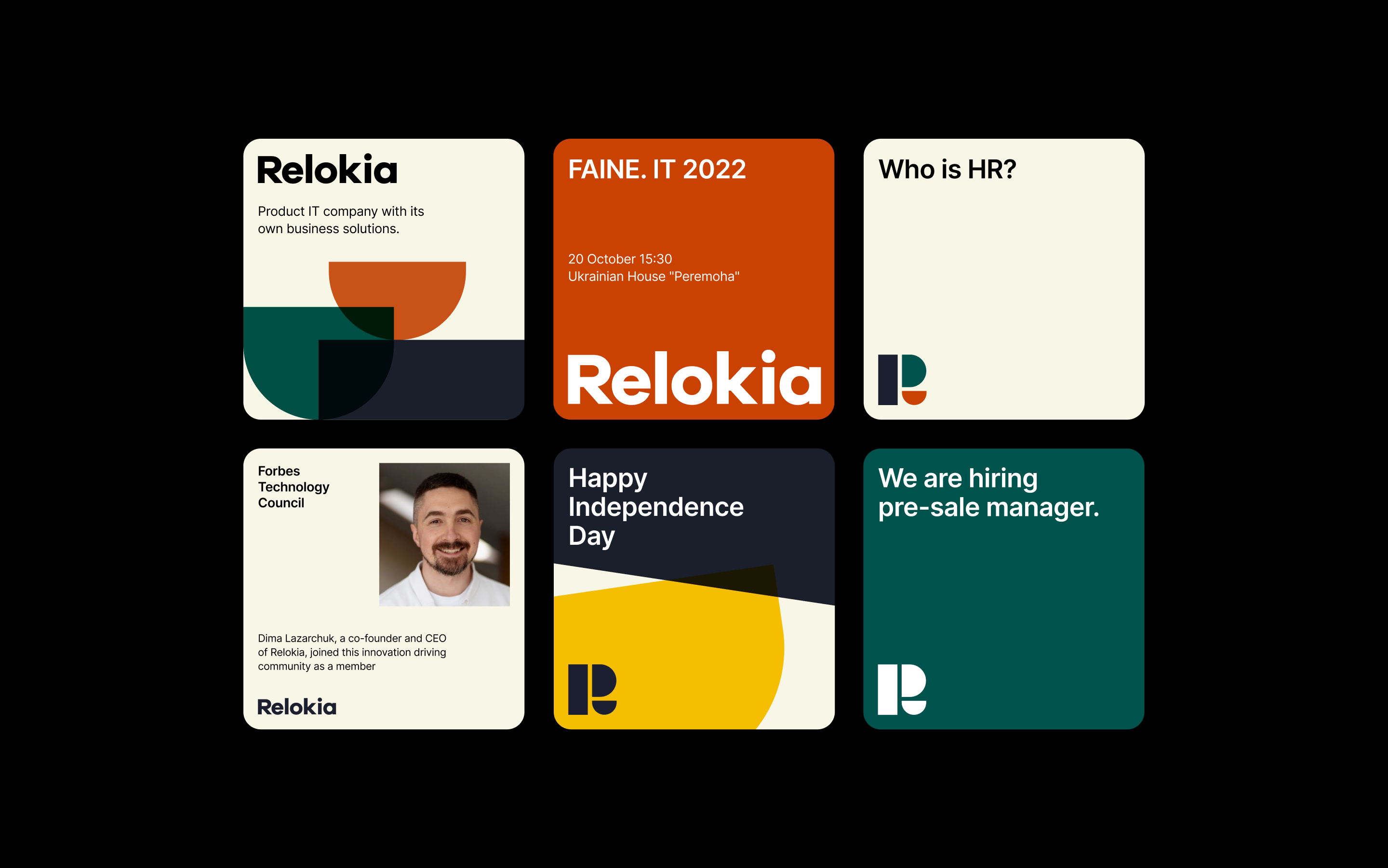
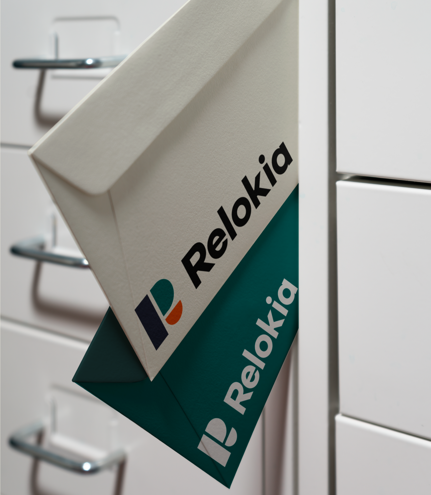
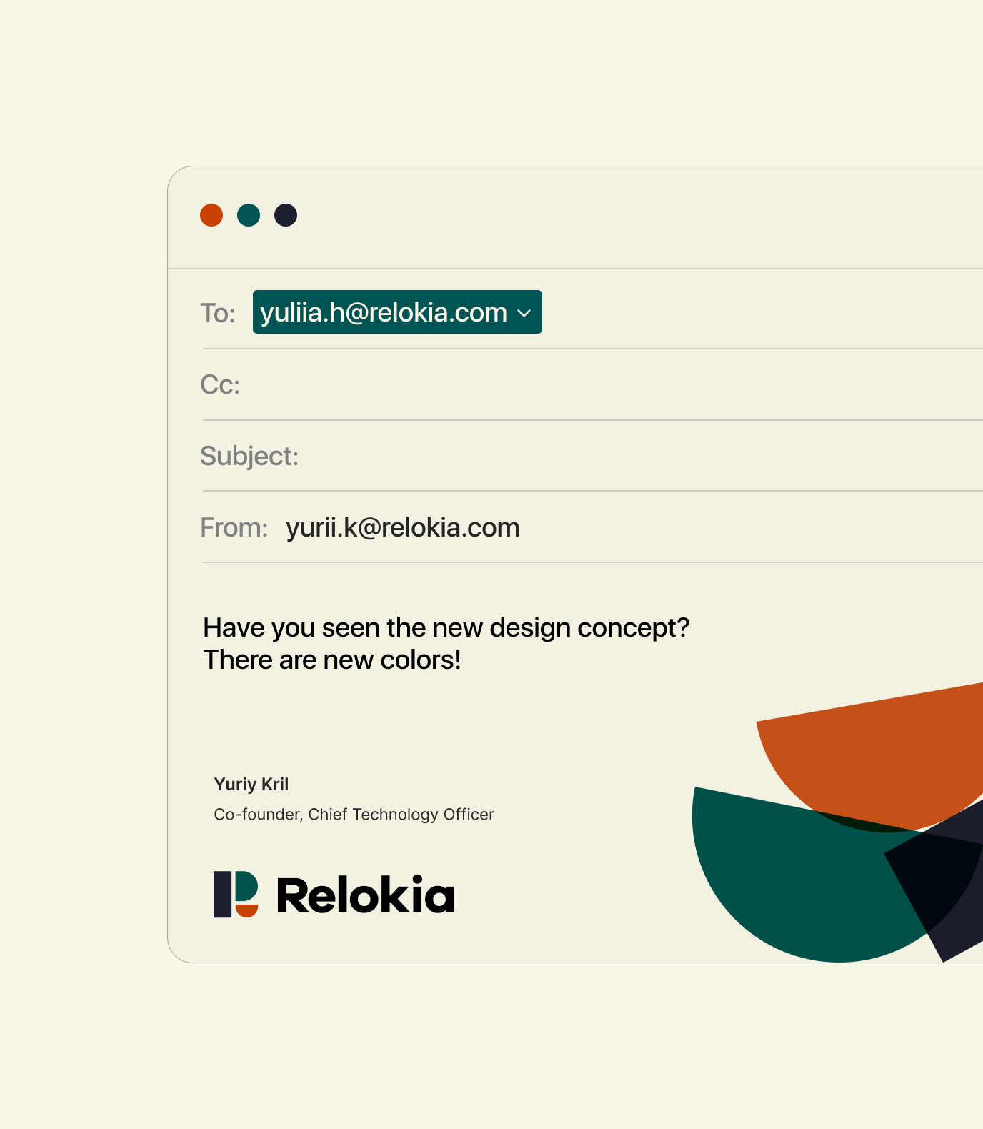
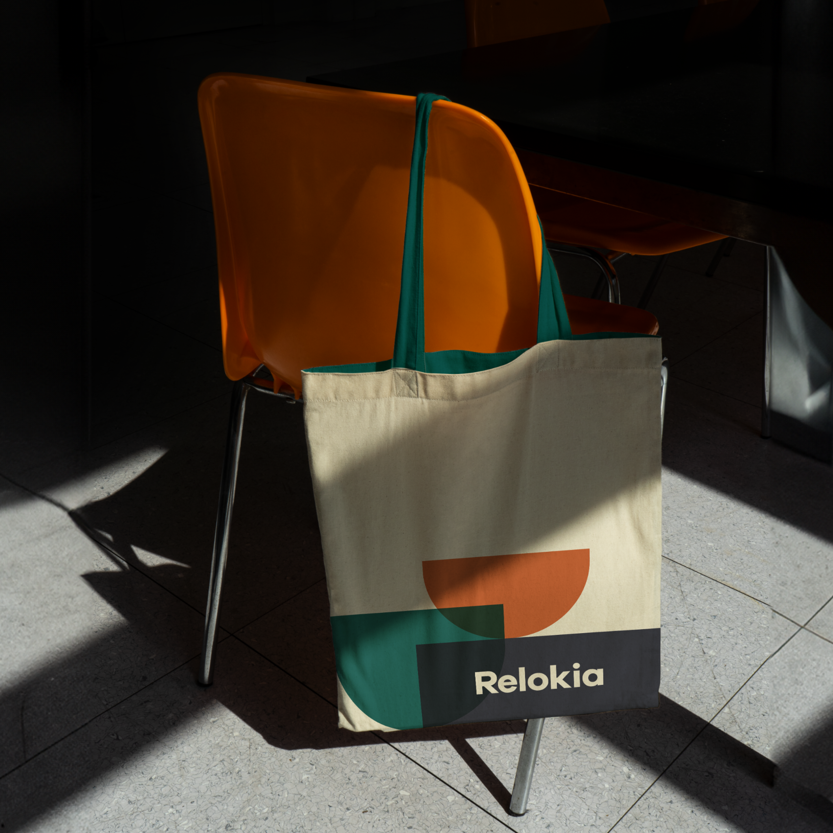
The logo comprises shapes that form the basis for creating graphic compositions for various cases.
The colors are subdued yet playful, aligning with the team’s mood and positioning.
The company’s lightweight symbol and typographic logo reflect its technological effectiveness and communicate a clear message: with Relokia, everything is simple.
Relokia embodies ease, speed, and solution-focus with a fitting look and this project illustrates how the service’s advantages can be conveyed through its identity.
A brand system centered around a single style-defining element—a logo with shapes—can give materials unpredictable yet consistent forms.


Credits
Sviatoslav Iablonsky
Art Direction
Anatolii Todorov
Graphic Design
Yuliia Hnatkova
Project Management