

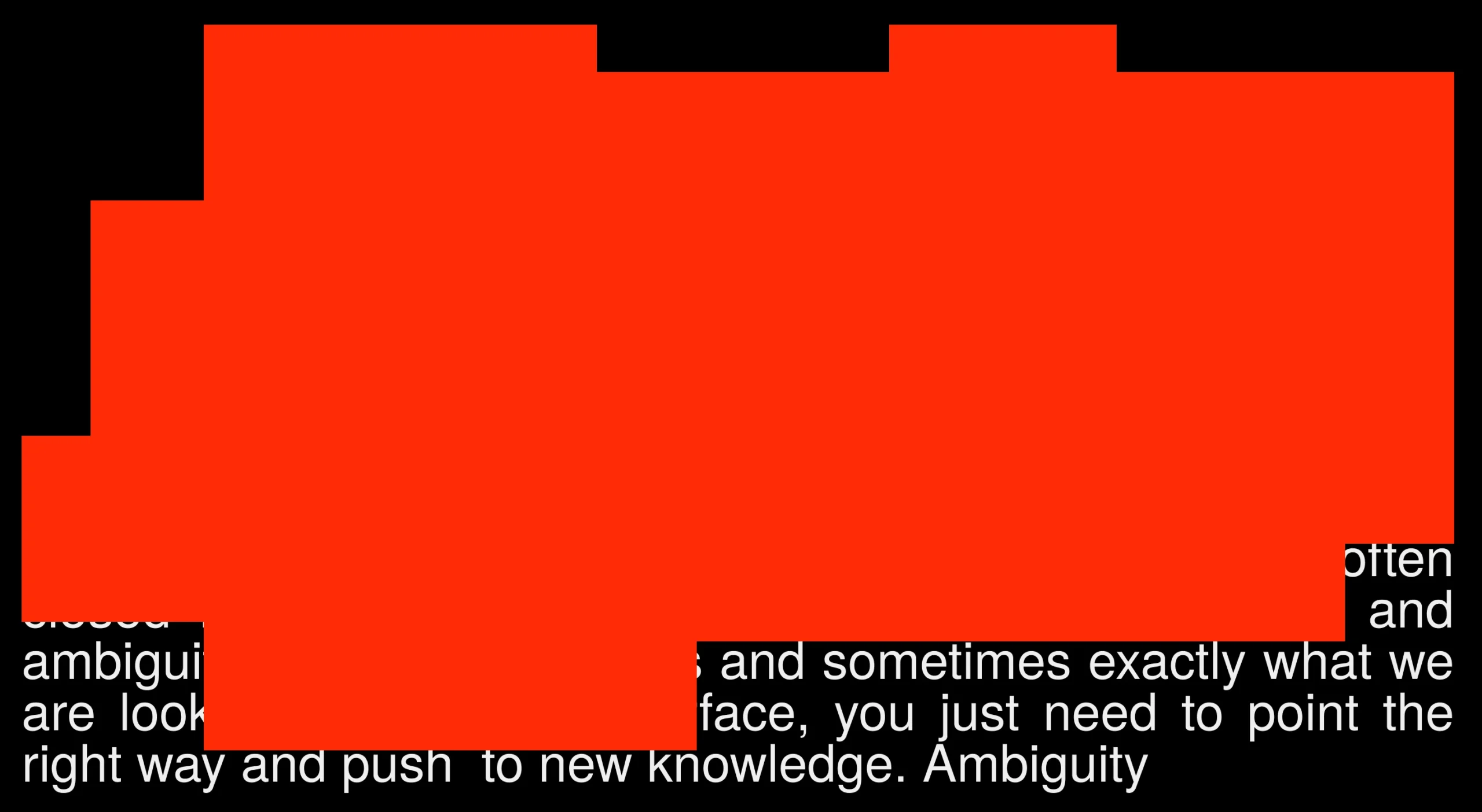


Doors Closed
Services
Website
Industry
Social Impact
Awards
Red Dot Design Award
Awwwards
CSS Design Awards
ADC*UA
Ukrainian Design: The Very Best Of
Behance x2
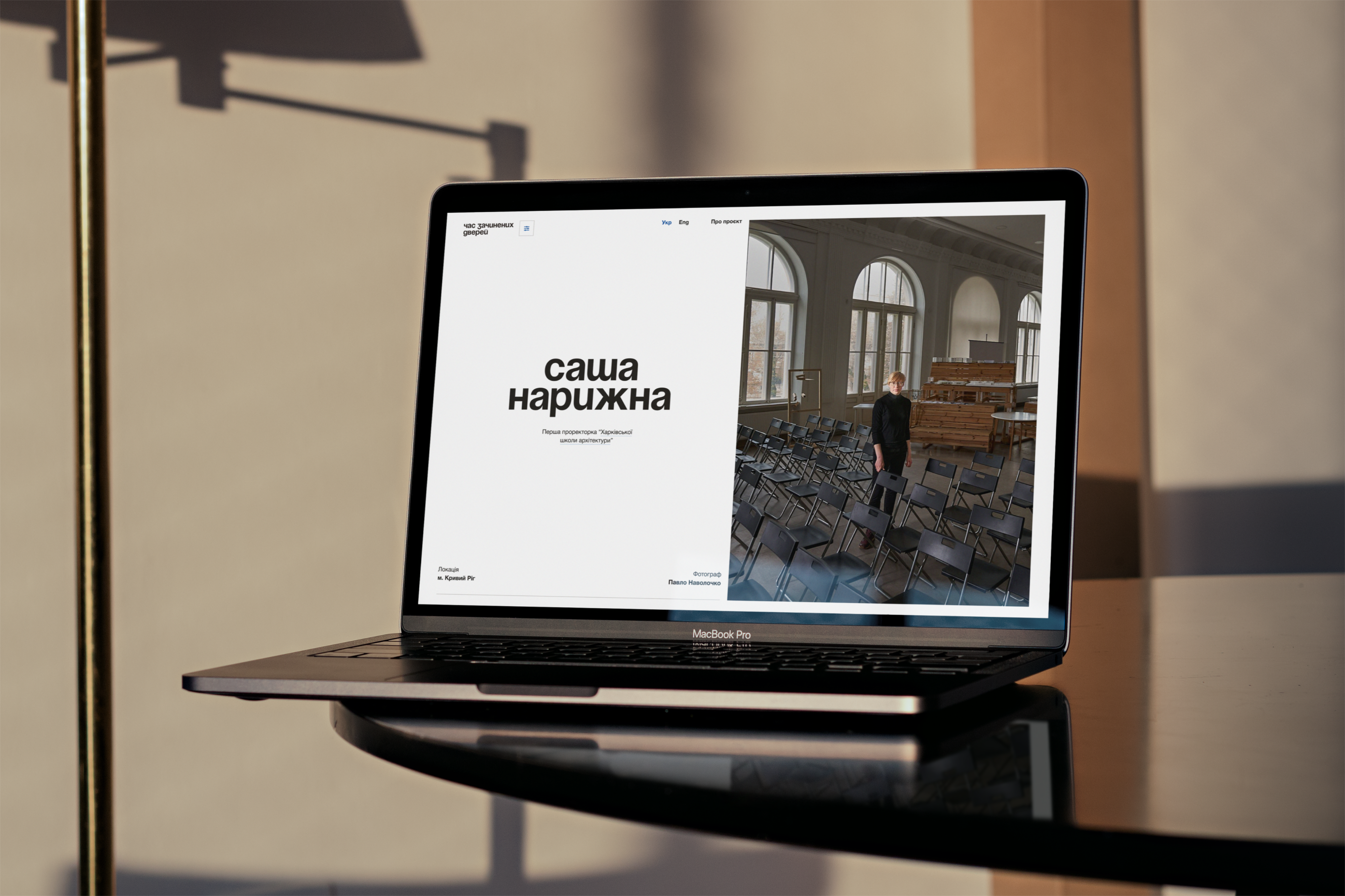
Design of a poetic website for a documentary project about the fate of Ukrainian business during the pandemic.
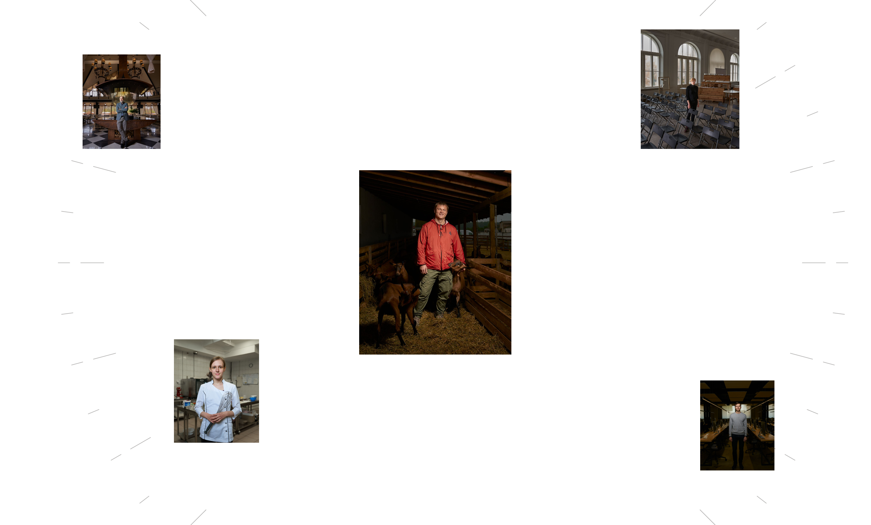
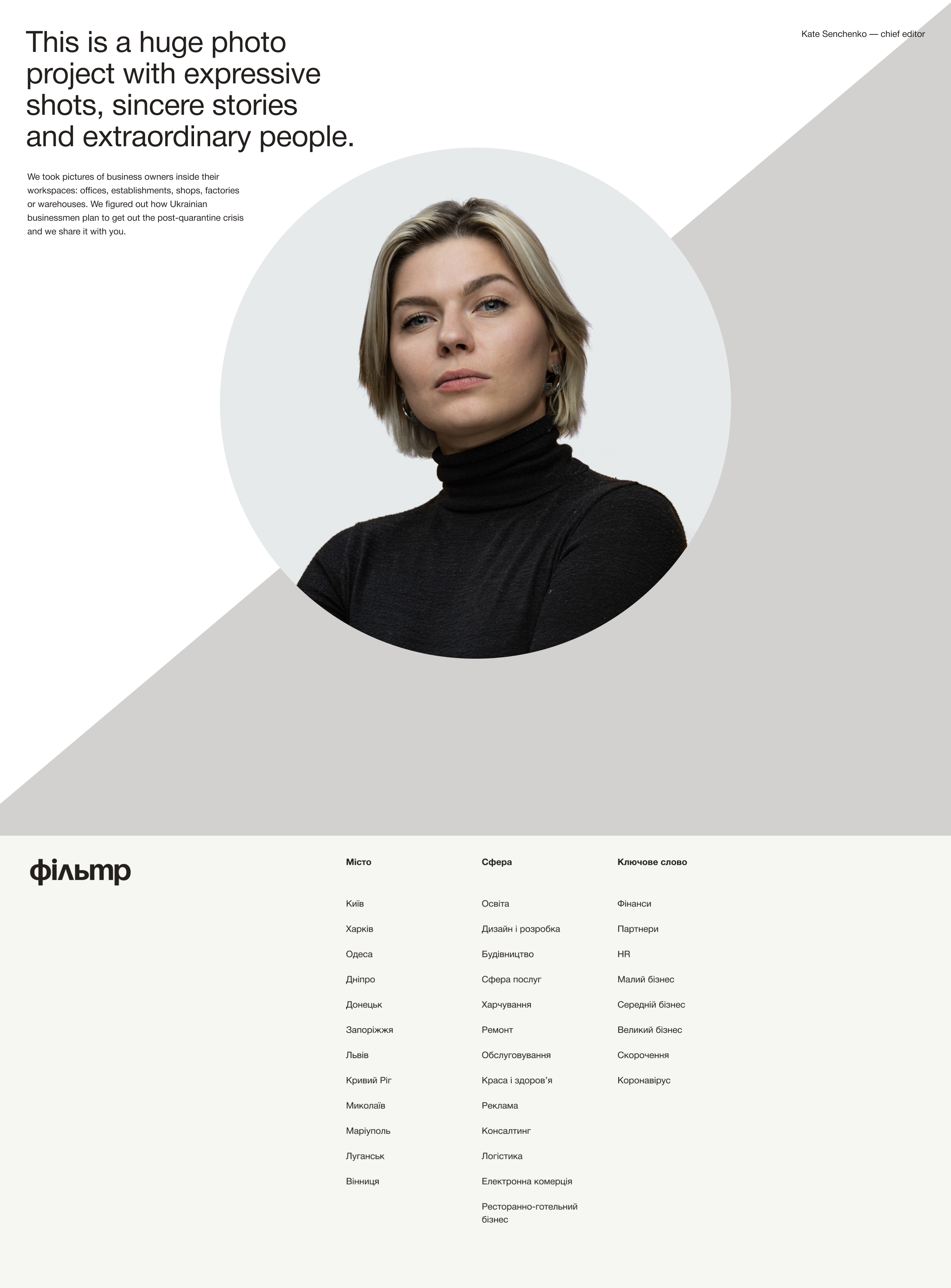
At the onset of the COVID-19 pandemic, The Gate Agency created a documentary photo project called “Doors Closed” about the reaction of Ukrainian businesses to the corona crisis. The idea behind the project was simple: business people from different cities in Ukraine shared their companies’ experiences that they were forced to close due to the pandemic.
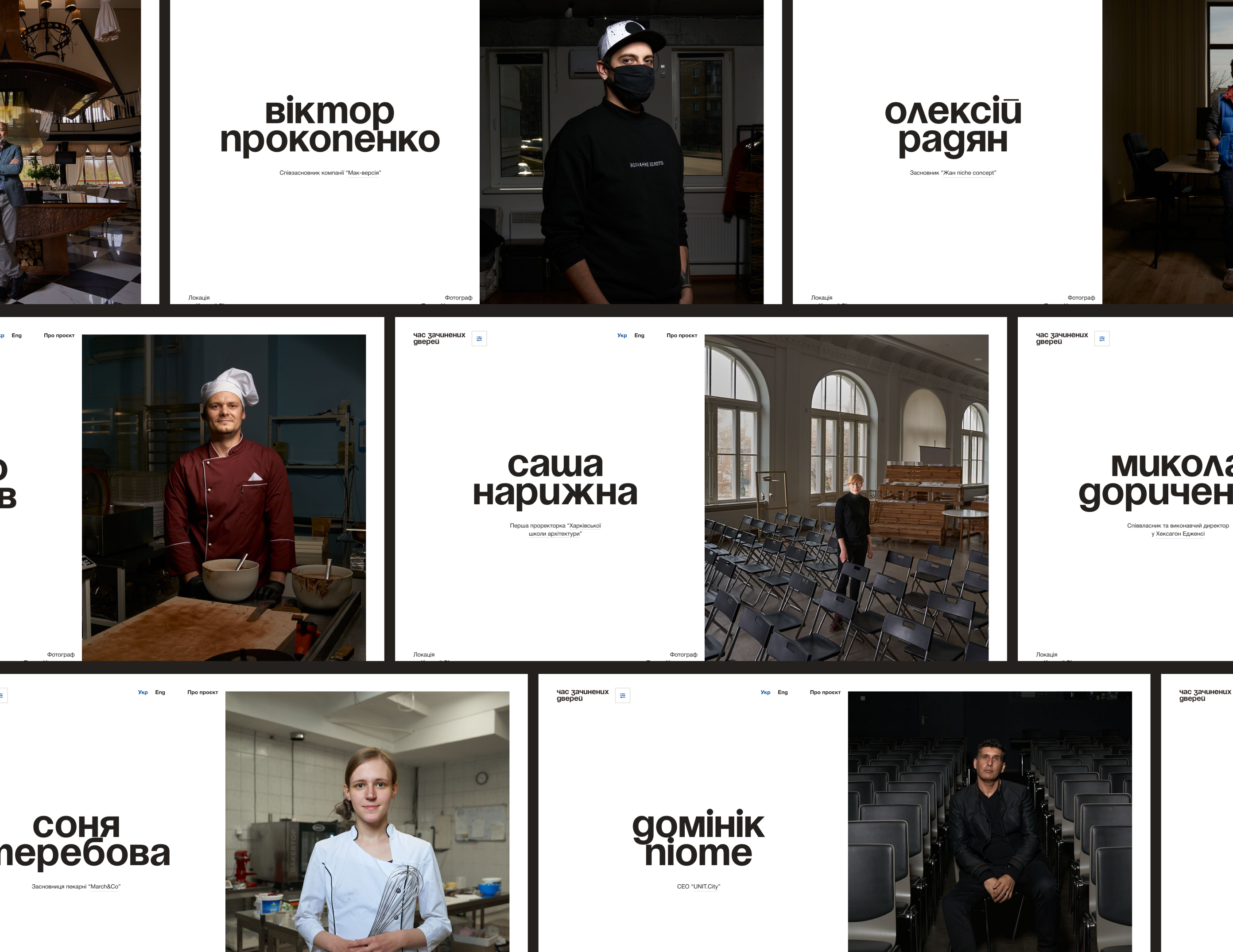
People in empty factories, warehouses, restaurants, and offices told stories of humility, determination, hope, and plans to overcome the crisis. Hexagon’s partner and then-CEO, Dima Boychuk, was invited to share our team’s experience. Recognizing the project’s importance, Dima suggested that The Gate Agency create a website where all these stories would be accessible to others.
We developed the concept of the website based on an observation: social projects often tend to be dull, monotonous, and spineless on the web. We needed to create an impactful site where all materials are easily readable, without barriers, conveying the spirit of the times.
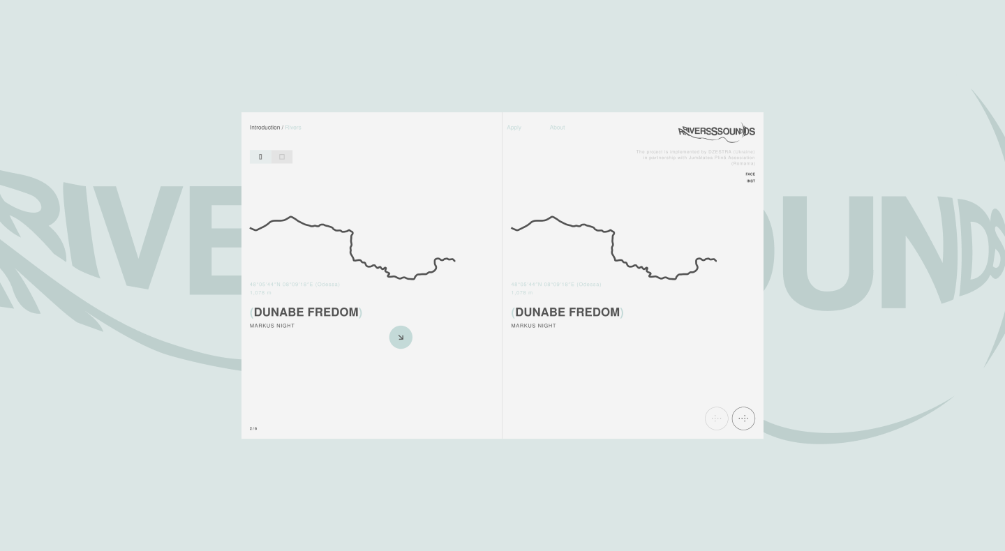
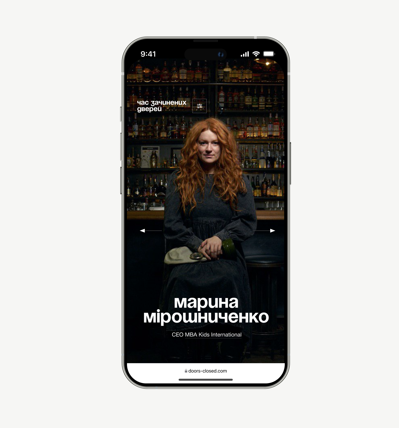
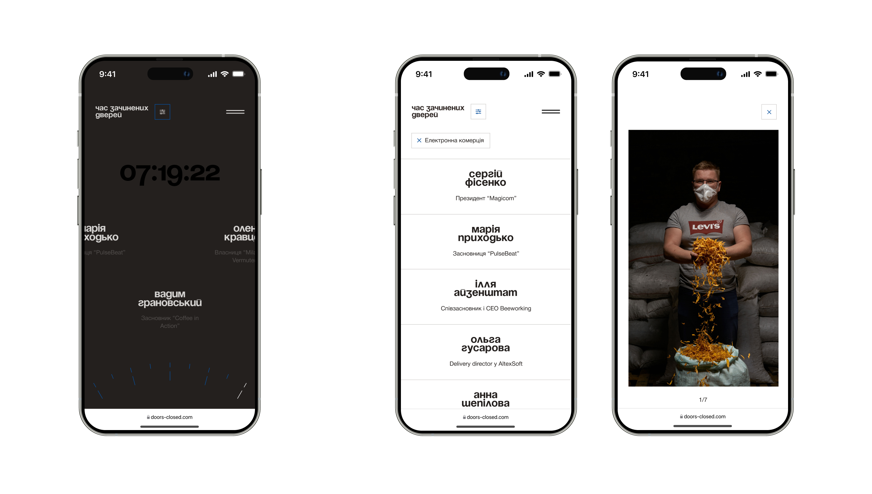
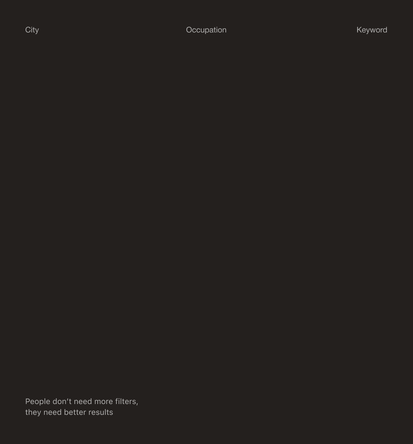
While all stories were related to the same issue, each was unique and worth attention. The site offers the choice between free exploration and navigation through sections using a filter for different types of inquiries – for those seeking something specific and those interested in particular businesses or cities.
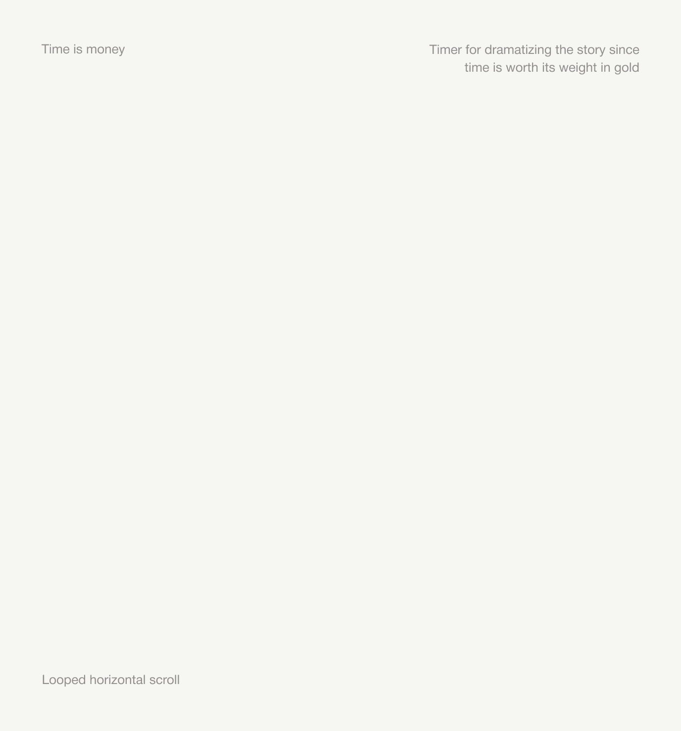
The looping scroll on the homepage addresses the prioritization issue — now, all materials can be seen as the horizontal scroll works in both directions. The entire site architecture supports our embedded idea of “not letting people stop.”
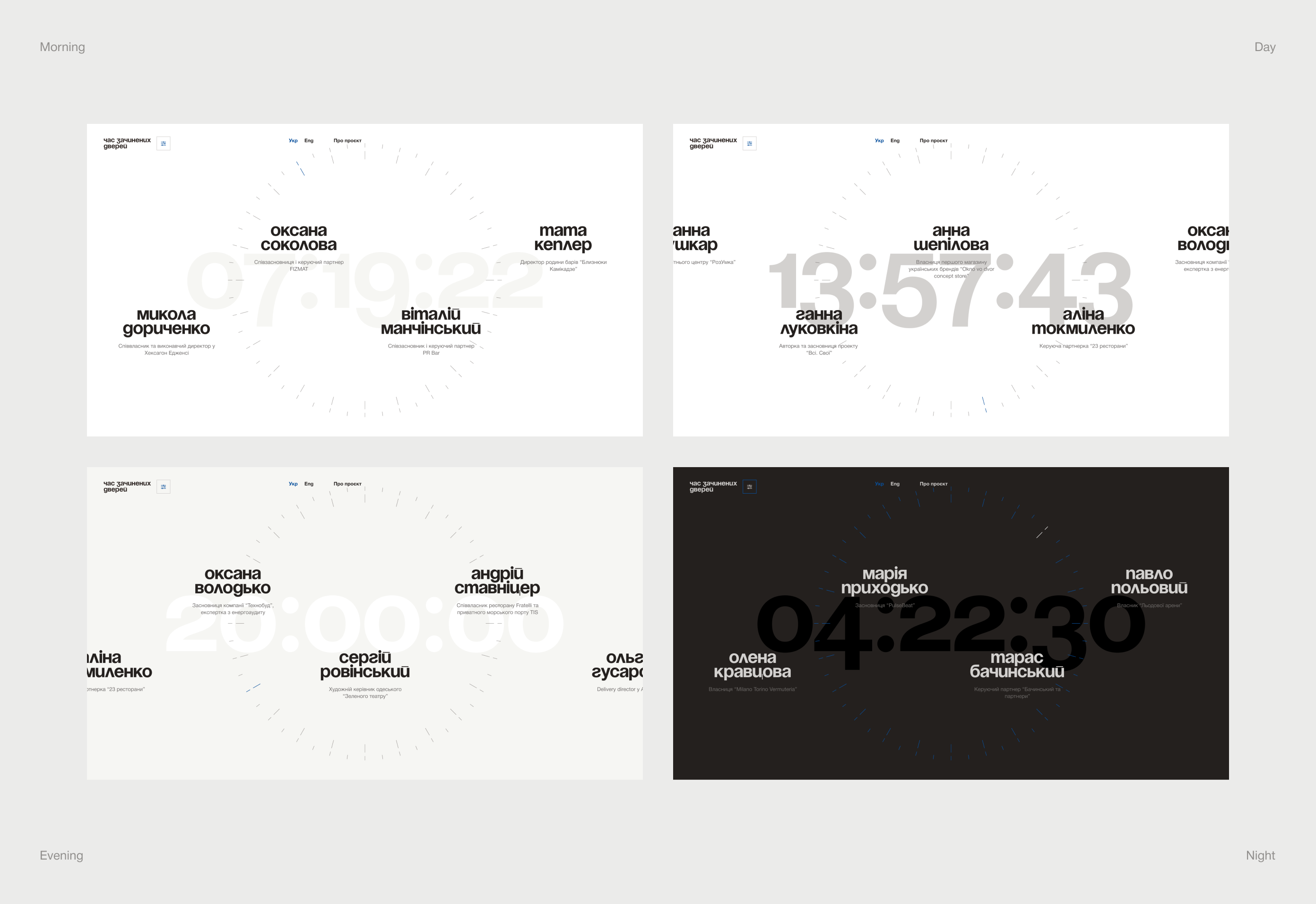
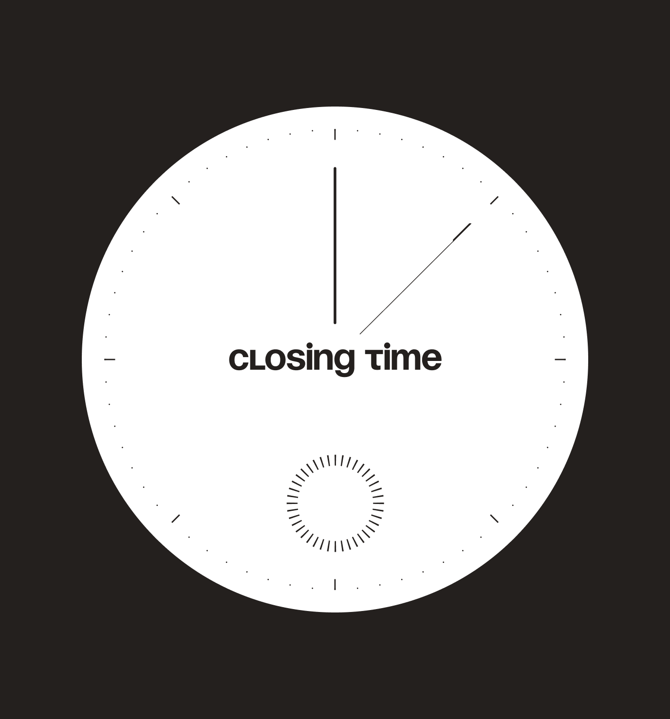
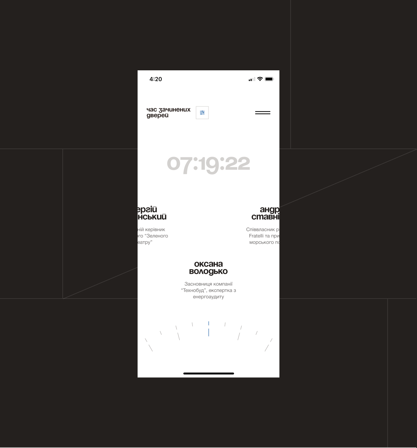
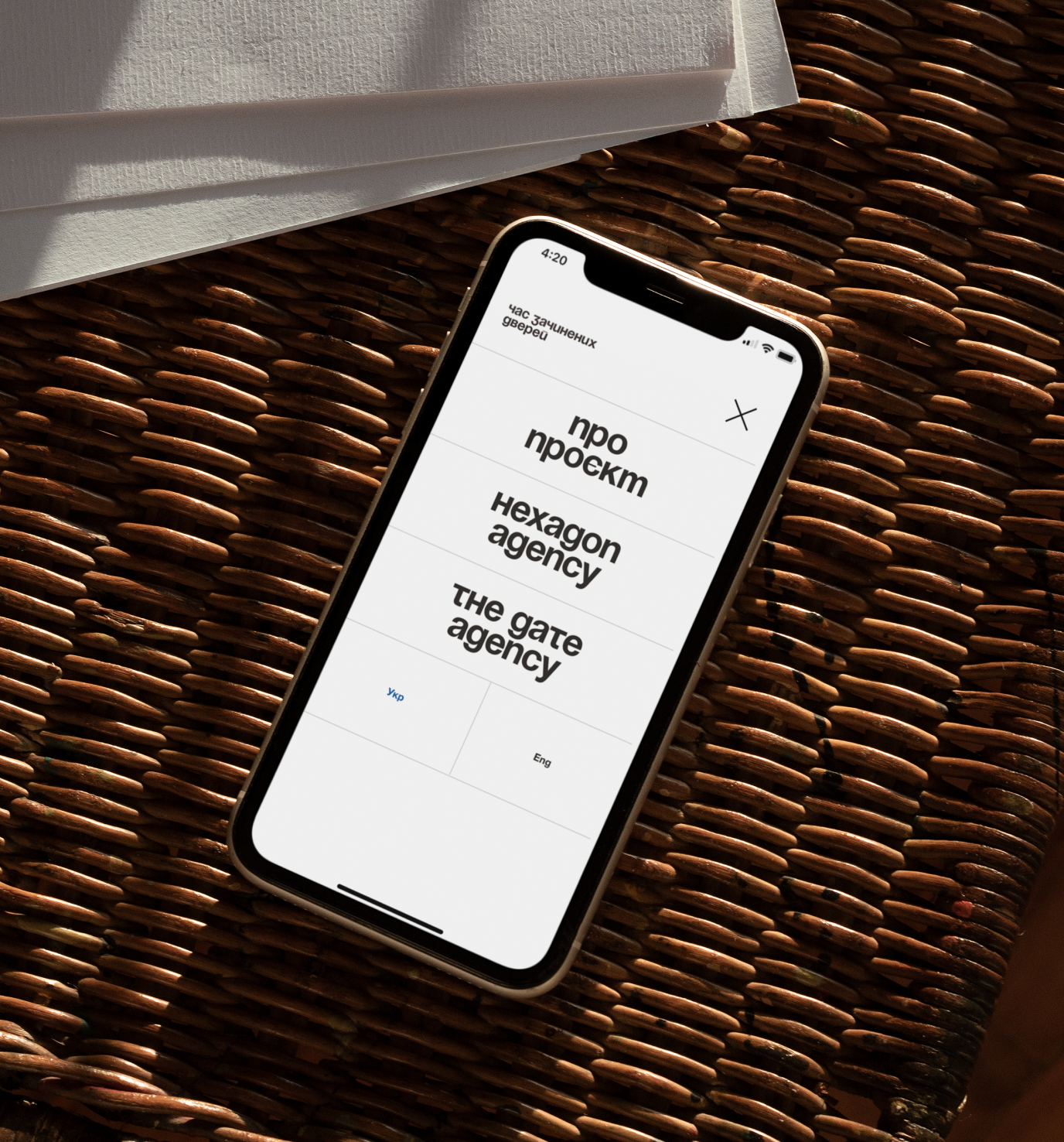
One of the key visuals of the project is the timer on the main page. It counts how much time has passed since the rules changed — the start of the quarantine.
This isn’t the only reference to time and its fluidity: the four color schemes of the website — morning, daytime, evening, and nighttime — change throughout the day.
A clock also appears when loading pages and components.
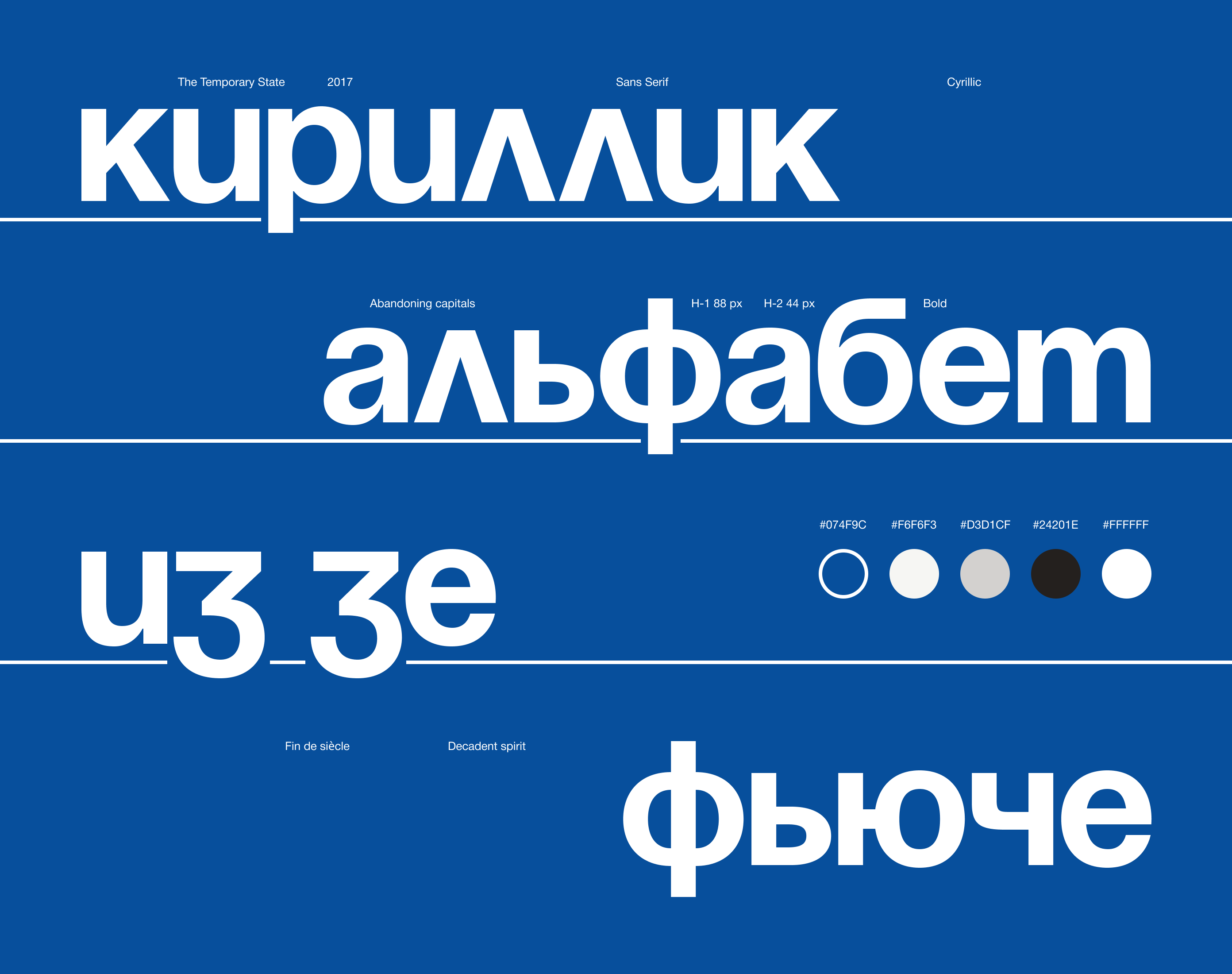
In titling the site, we followed the Bauhaus concept of “kleinschreibung” — the absence of capital letters. This idea makes the text set more rational and symbolizes democracy and equality. The pandemic made everyone equal in the face of the crisis, placing everyone in the same conditions.
Undoubtedly, Ukrainian society needed such stories to gain inspiration and not give up. Our goal was to help the project be remembered not only for its mission but also for its presentation. The infinite scroll, typography, stories, and symbolism make this project poetic, not dull.
We helped life-affirming stories be heard.
And if the crisis often presents us with a choice — to give up or not, the stories on the site unequivocally say — never!


Credits
Dmytro Boychuk
Art direction
Oleh Smieltsow
Web design
Anna Shulga
Web design
Yehor Petrenko
Project management
Grygoryi Vepryk
Photography
Kate Senchenko
Editorial work