











Oazis Car
Services
Brand
Industry
Taxi & Car Rental
An oasis in the middle of the city grind.
Oazis Car had grown into one of the largest taxi fleet operators in Poland – but its visual identity hadn’t kept up.
The original logo was a quick fix from the early days, and the brand was starting to hold the business back as the company looked to enter new markets and expand its service lines.
They came to us needing more than a new logo. They needed a design partner to help them build a coherent brand system – one that could scale across sub-brands, geographies, and touchpoints, while still feeling direct and human to the people it serves most: drivers.
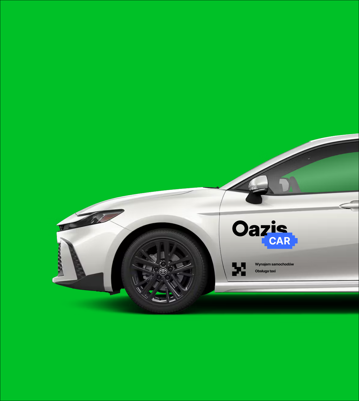
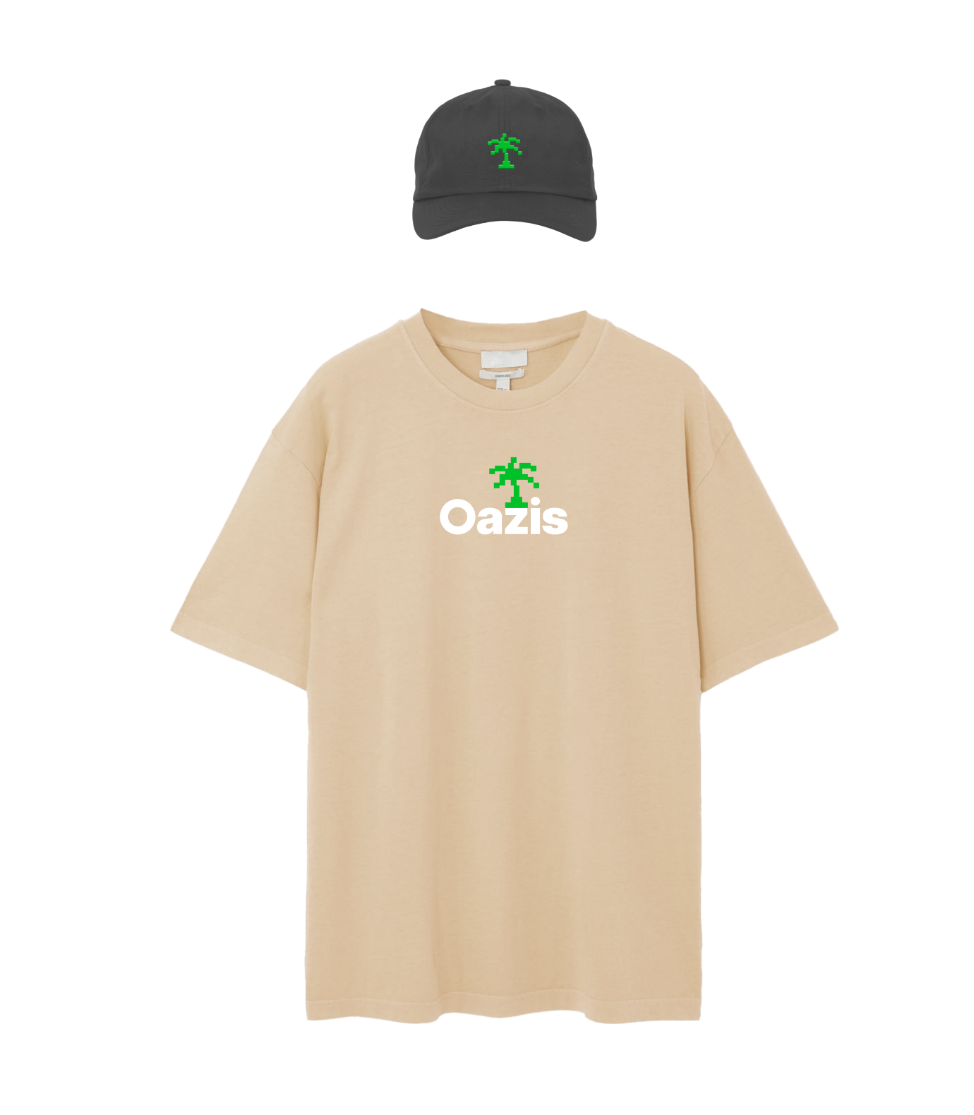
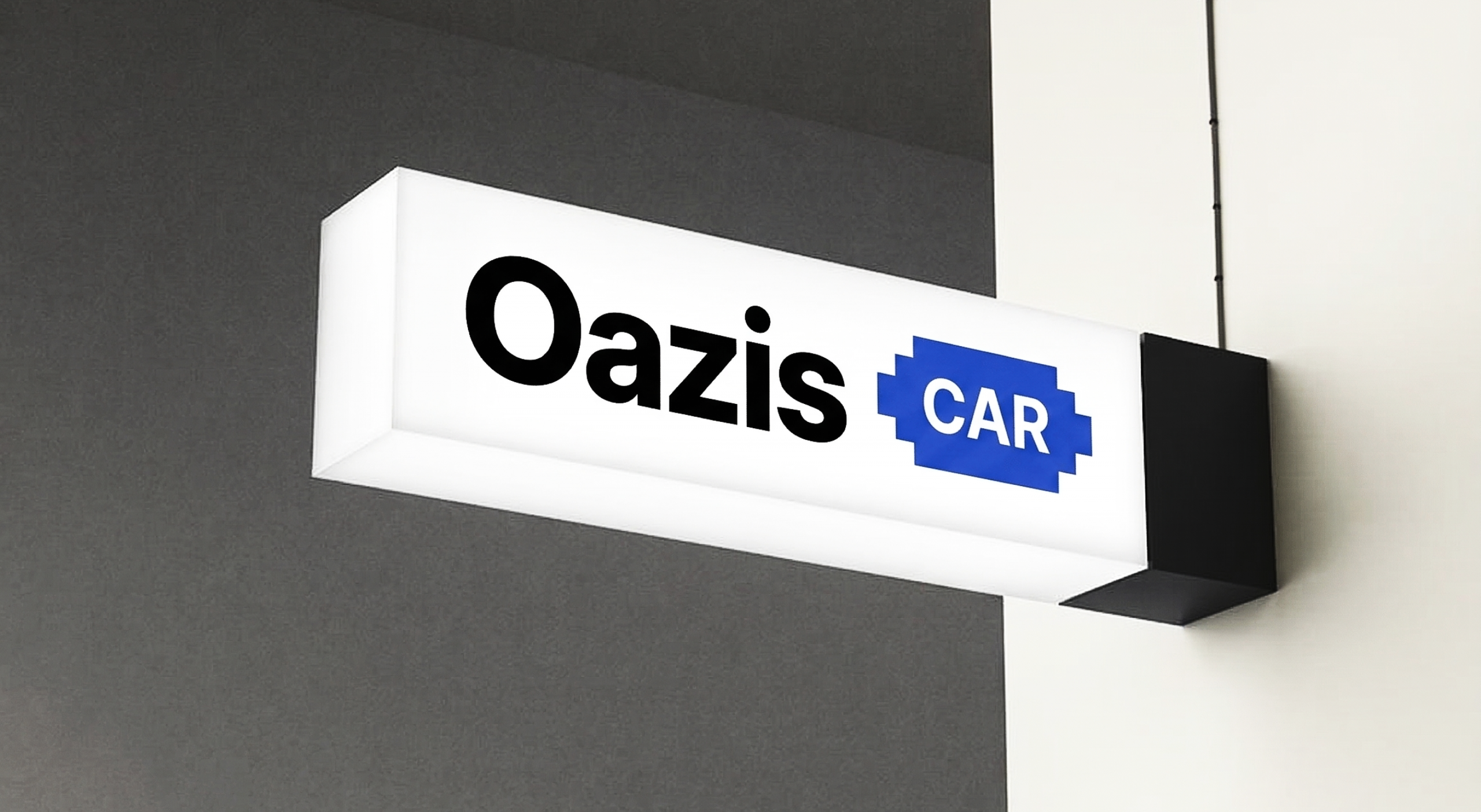
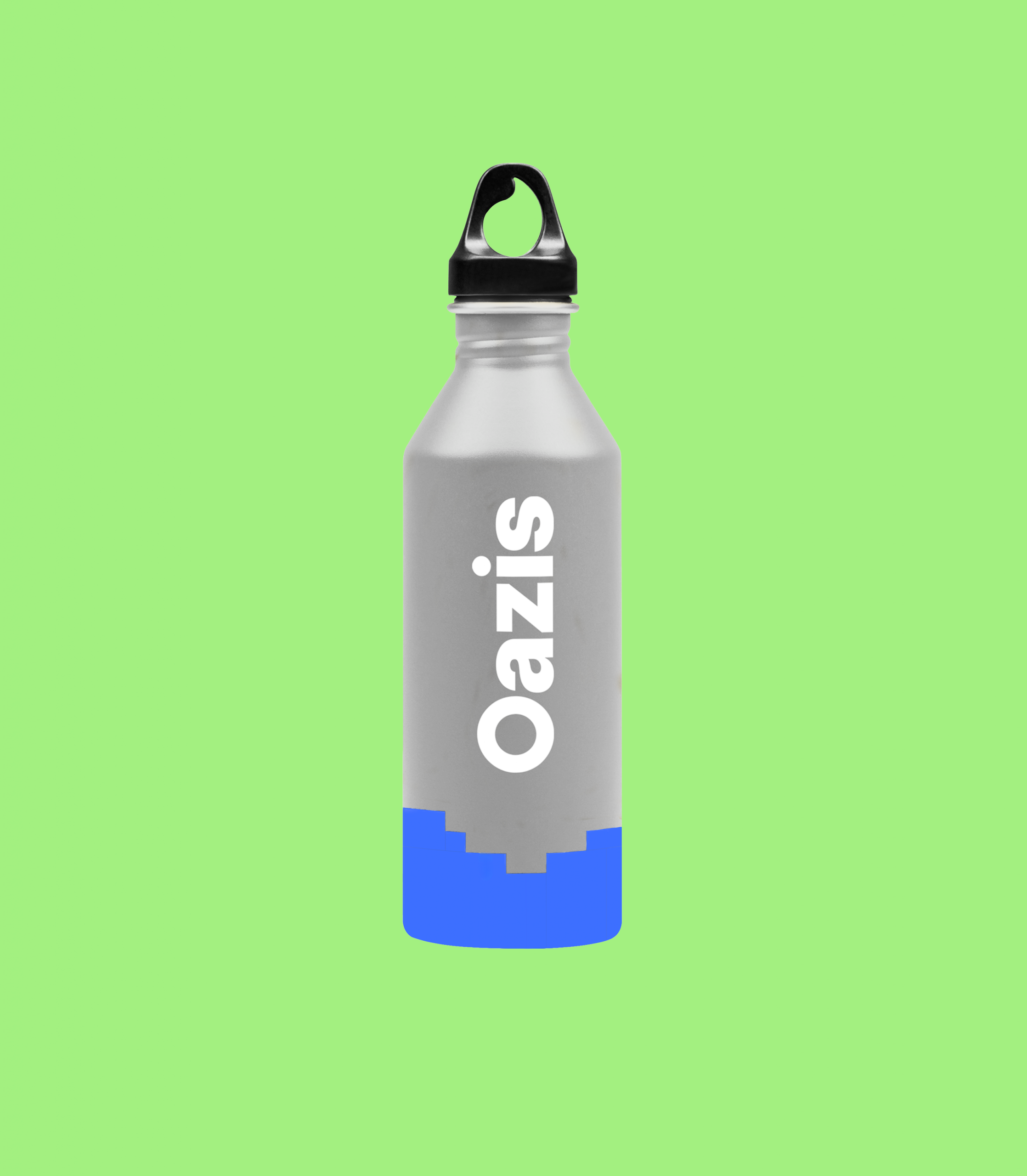
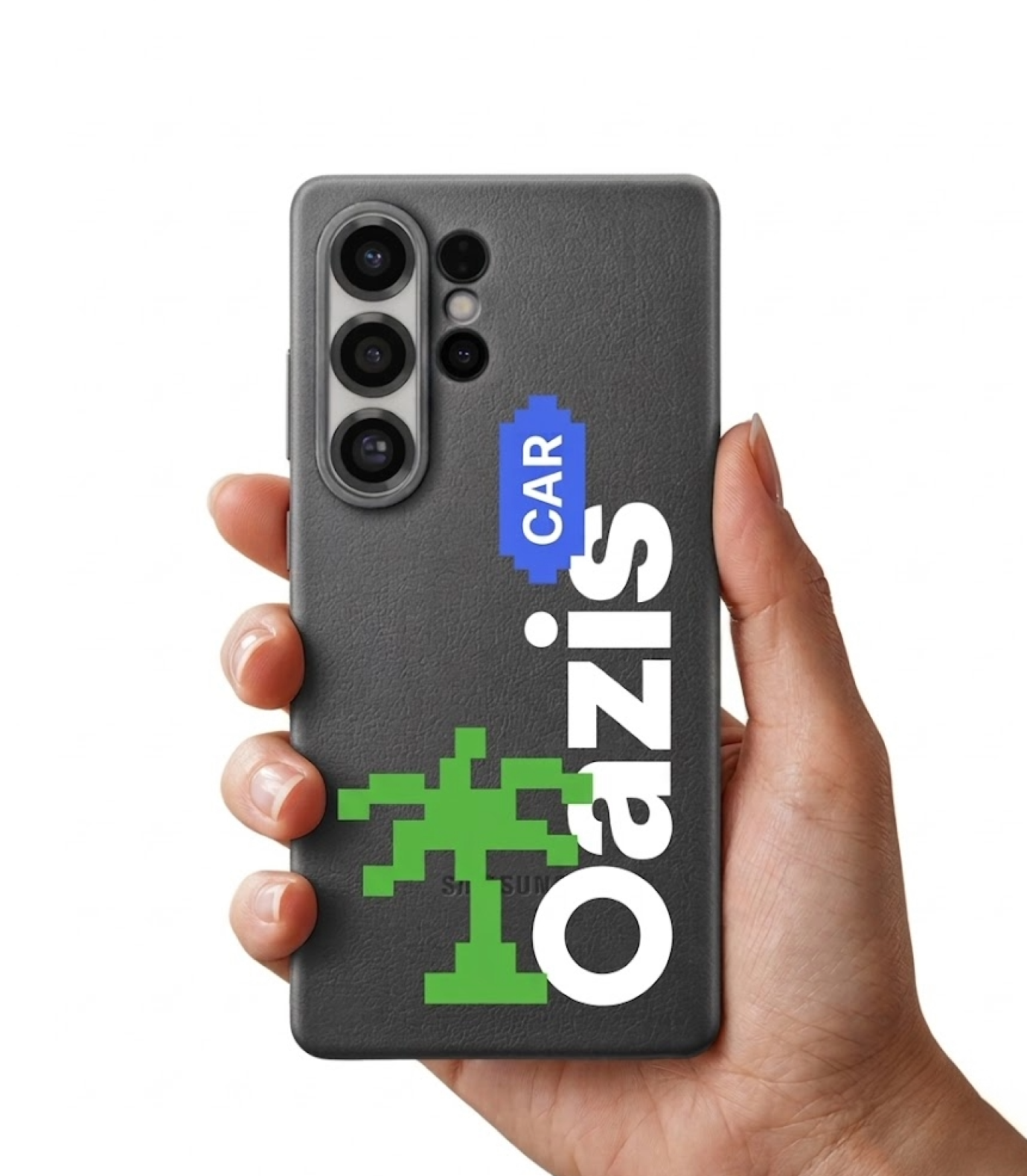
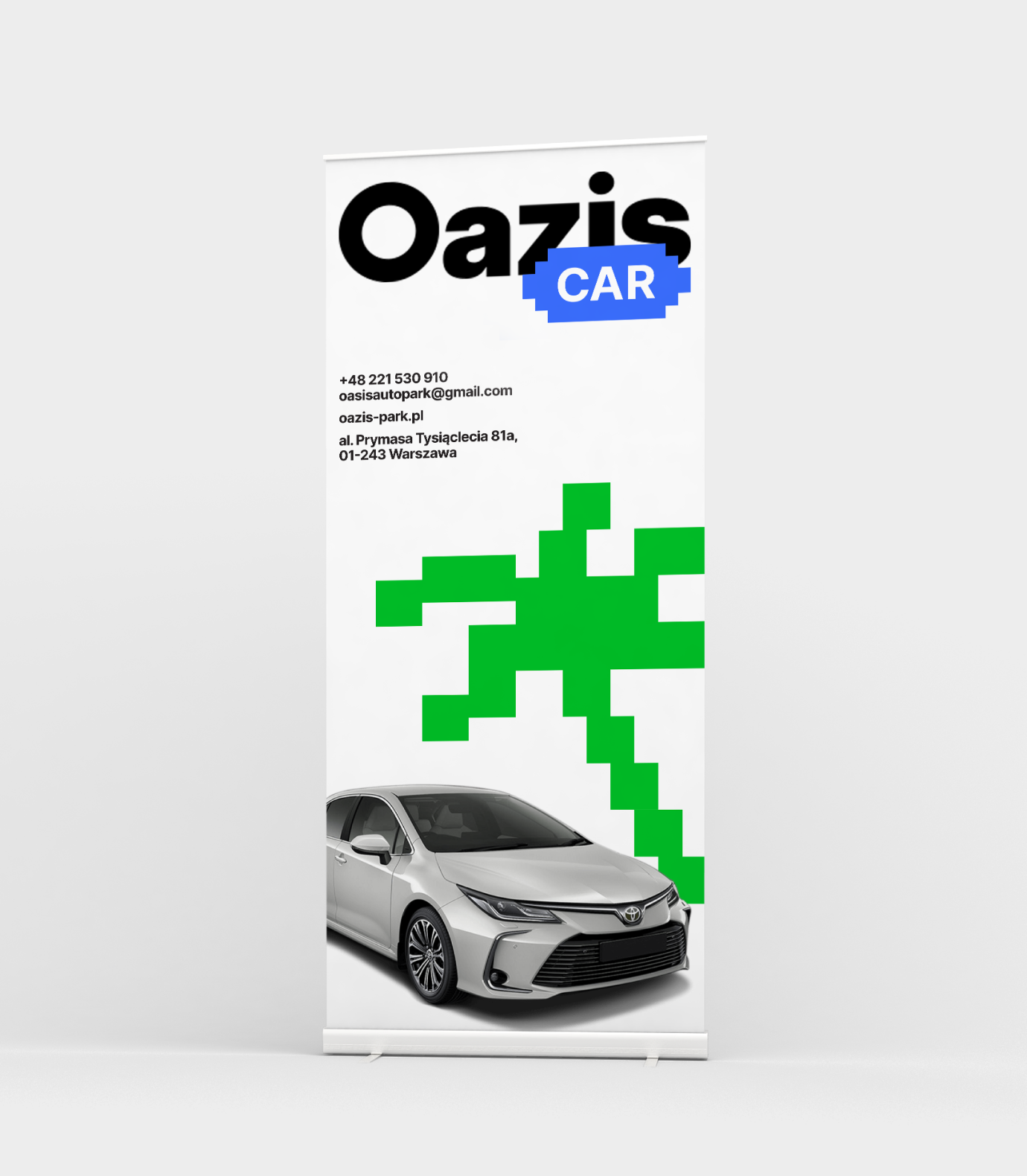
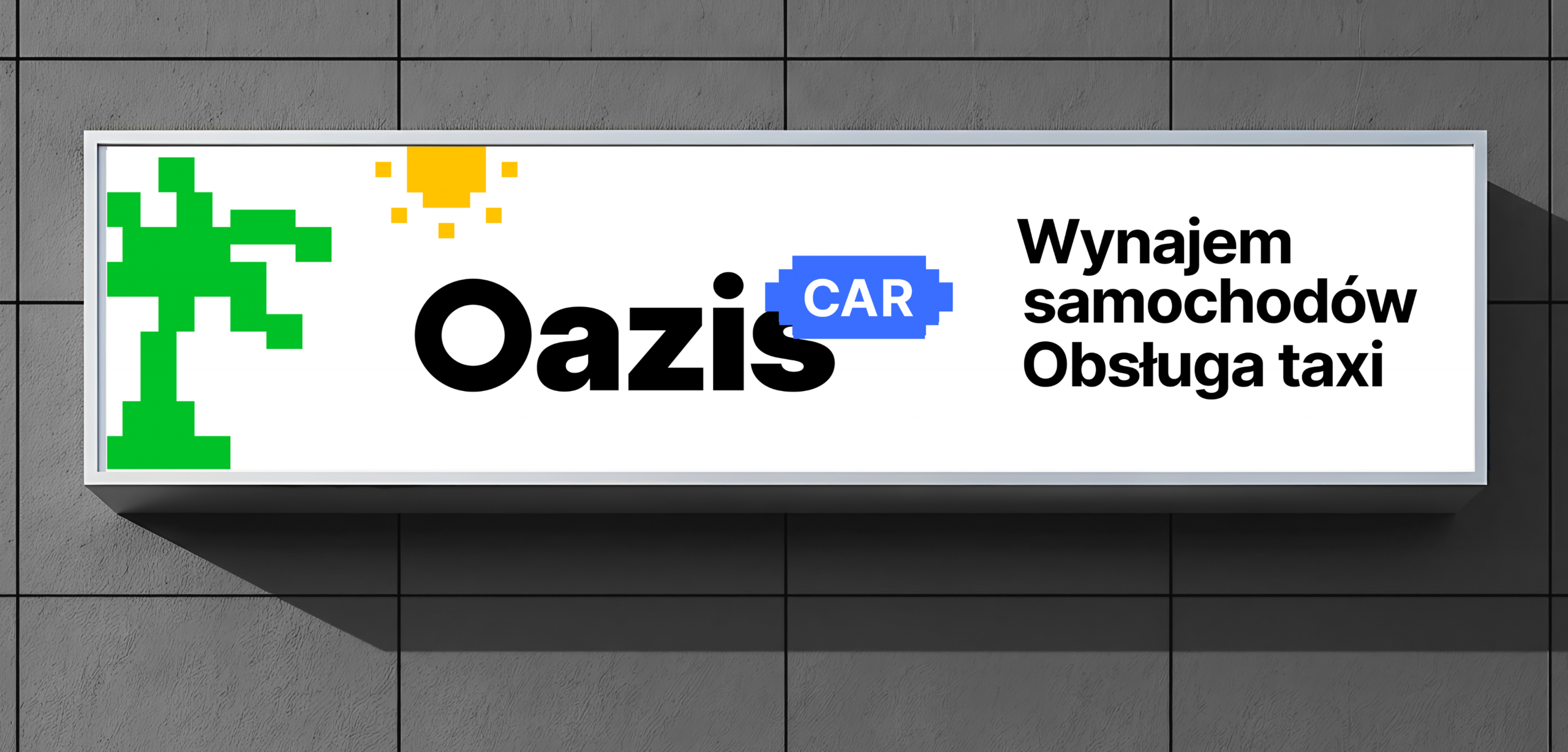
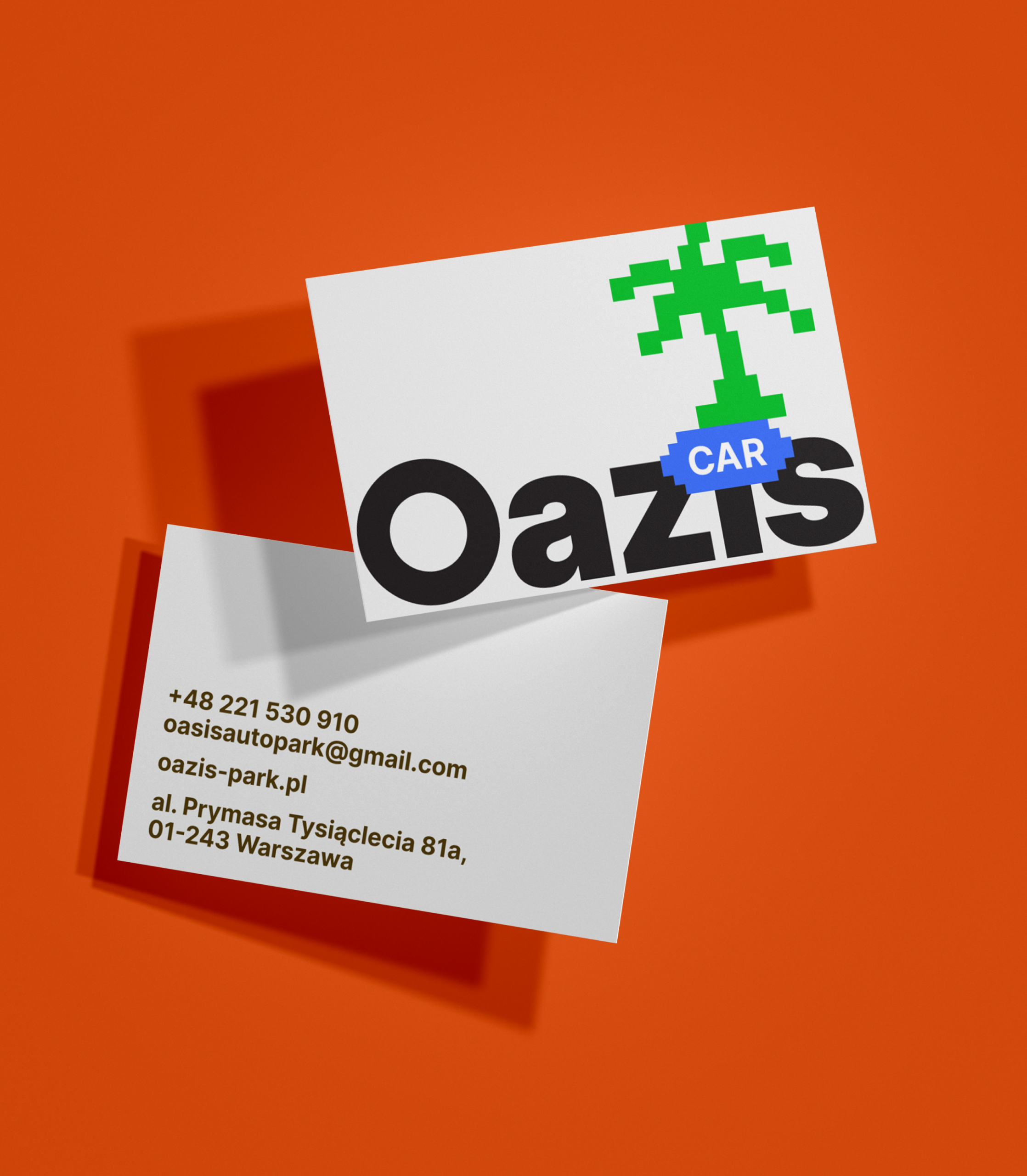
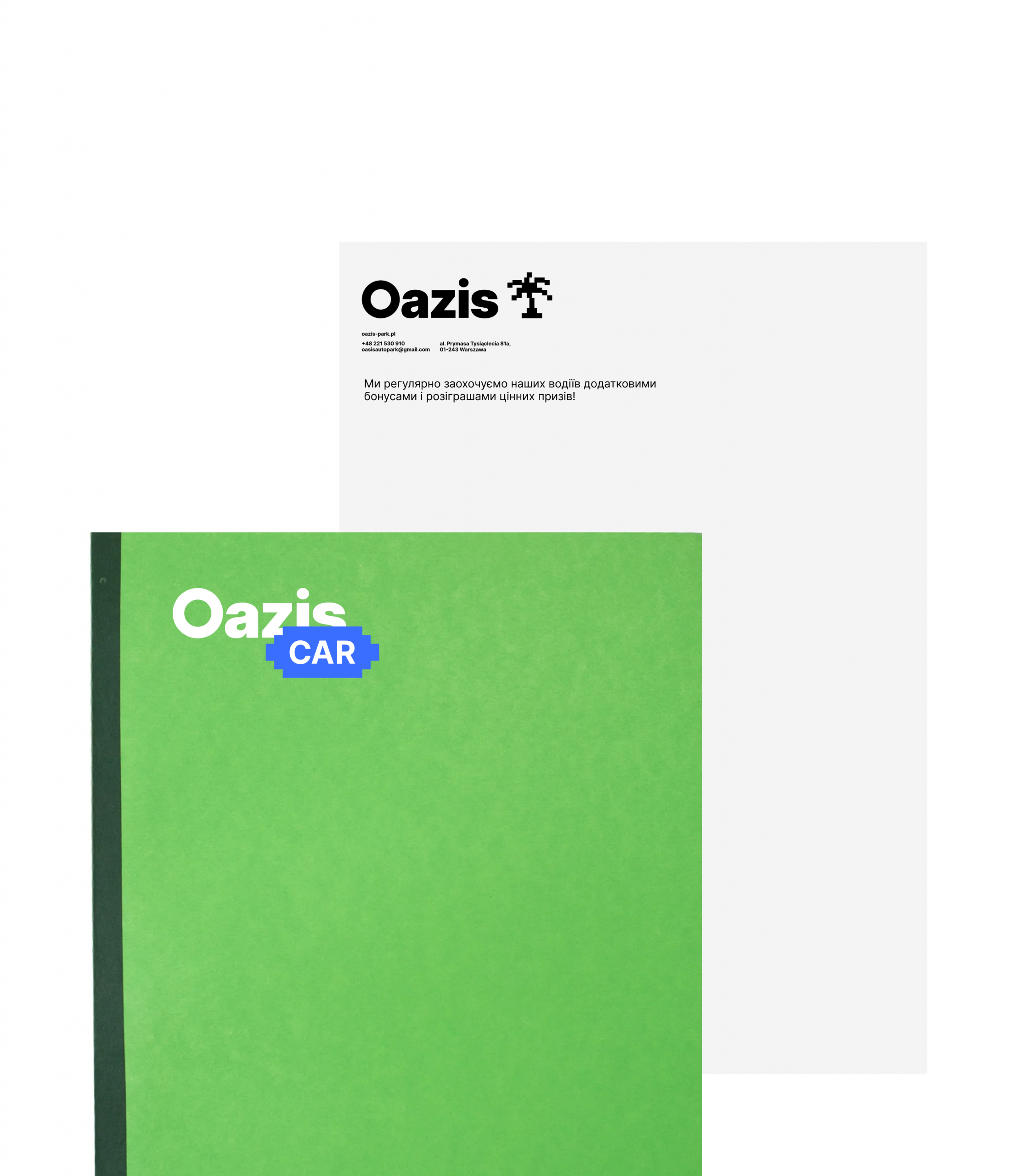
We built the identity around a single, clear idea – an oasis in the city. A place of calm and clarity in the middle of the daily grind. The visual system centers on a pixel-art palm tree, reinterpreted from the classic taxi checker pattern. Block forms, bold color, and a graphic language rooted in simplicity make the brand easy to read and hard to miss – whether it’s on a car wrap, a Warsaw street-level banner, or an Instagram post.
The system was designed to flex. The logo adapts across directions – Oazis Car, Oazis Park, Oazis Fleet – using a consistent visual logic that’s easy to extend without breaking the whole. Color, type, and graphic elements all follow the same principle: clear, honest, no unnecessary complexity.
Taxi and fleet rental is a crowded, often cold-looking category. Most brands in this space default to corporate blues and generic stock imagery.
We wanted to bring something different – a brand that actually speaks to drivers as people. One that says: starting work doesn’t have to be stressful. The paperwork is simple. The cars are ready. Everything is taken care of.
The identity doesn’t just make Oazis Car look better. It gives the brand something to say.

Credits
Sviatoslav Iablonskyi
Art Direction
Anatolii Todorov
Graphic Design
Yuliia Hnatkova
Project Management